Below is information from many different sources on how the U.S. federal government spends money. Several bar and pie charts are also included. All the charts expand to make the data easier to view. Click on a chart to expand it, and click on the expanded chart to shrink it back to its original size.
The first three charts are from the Office of Management and Budget, which provides the official numbers for the annual budget for the U.S.
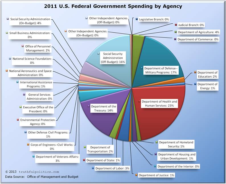
- The first chart shows spending by government agency as of 2011 (the most recent numbers available as of the writing of this article).
- “Undistributed Offsetting Receipts” are not included.
- Some of the percentages are 0% due to rounding.
- To view the source data, please refer to Table 4.1 of the budget.
Click on the chart below to see an enlarged, clearer chart.
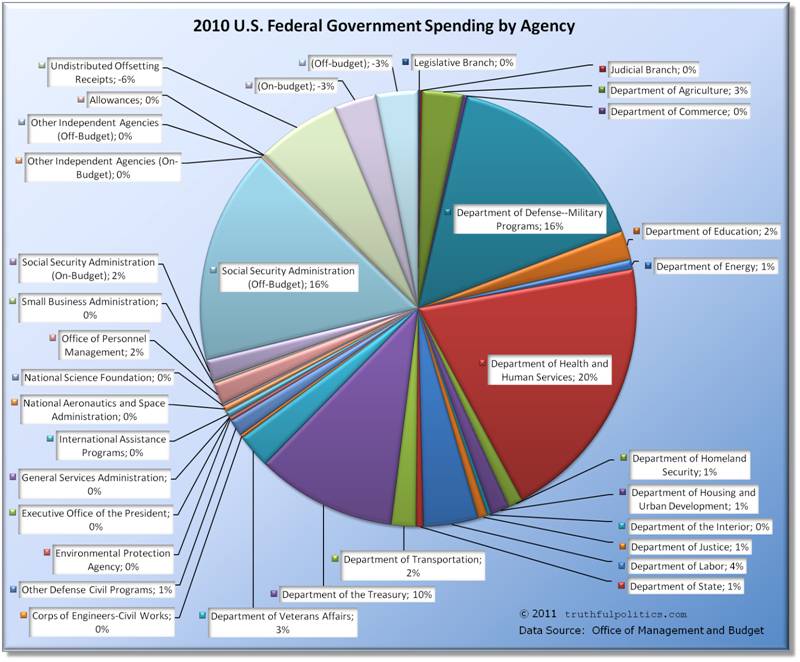
- The second chart shows spending by government agency as of 2010.
- Some of the percentages are 0% due to rounding.
- To view the source data, please refer to Table 4.1 of the budget.
Click on the chart below to see an enlarged, clearer chart.
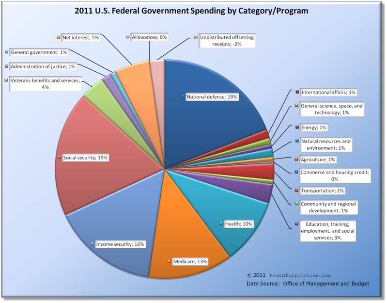
- The third chart shows spending by government program as of 2010 (the most recent numbers available as of the writing of this article).
- Some of the percentages are 0% due to rounding.
- To view the source data, please refer to Table 27-14 of the budget.
Click on the chart below to see an enlarged, clearer chart.
To read additional information, including the source data, click on Budget of the United States Government.
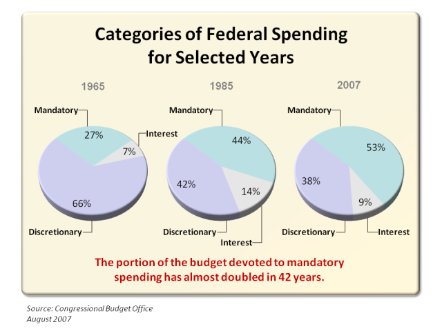
The website Federal Budget Spending, Deficits, and the National Debt has the following graph:
Click on the chart below to see an enlarged, clearer chart.

Click on Federal Budget Spending, Deficits, and the National Debt to visit the website.
The Heritage Foundation has the following chart:
For more charts, click on Federal Budget in Pictures.
The Perot Charts website illustrates trends in federal government spending:
Click on the chart below to see an enlarged, clearer chart.
Additional information and charts are no longer available as Perot Charts is now discontinued.
Project America illustrated overall U.S. federal government spending by department. The Department of Defense is not shown:
Click on the chart below to see an enlarged, clearer chart.
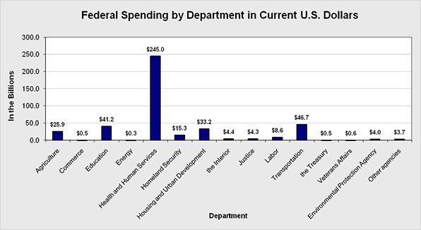
For additional information, click on Project America: Budget: Spending: Spending By Department.
Project America illustrated the overall U.S. federal government spending by program:
Click on the chart below to see an enlarged, clearer chart.
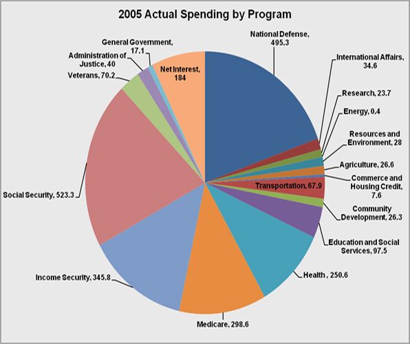
For additional information, click on Project America: Budget: Spending: Spending by Program.
MSN Money had an article summarizing how the US spends tax dollars:
- The biggest single chunk of that so-called nondiscretionary spending — more than 20% of the total budget — is used to pay Social Security benefits to retirees
- Another 15% pays the tab for Medicare health benefits
- An additional 7% goes for Medicaid, 3% for veterans’ benefits and 1.3% for supplemental security income used to assist the aged, disabled and blind
- Aid to poor families with children (welfare, which accounts for about 1% of the budget), food stamps (about 1.3%), farm subsidies (1%)
- Interest on the debt claims about 10% of the budget
To read the entire article, click on How Uncle Sam spends your tax dollar.
Sorry, the comment form is closed at this time.