truthful politics reviewed historical statistics on U.S. federal government revenue as provided by the Office of Management and Budget. The Office of Management and Budget provides the official numbers for the annual budget for the U.S. This article has several charts on U.S. federal government revenue; click on the chart to expand it; click on the expanded chart to shrink it back to its original size.
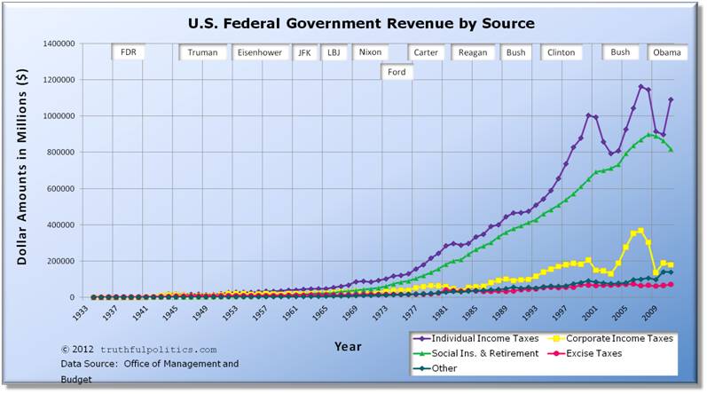
The first chart shows how much tax revenue was received by the federal government annually since 1934. The raw data comes from Table 2.1 of the budget report.
- The transition quarter, or TQ, in 1976 has been removed.
Click on the chart below to see an enlarged, clearer chart.
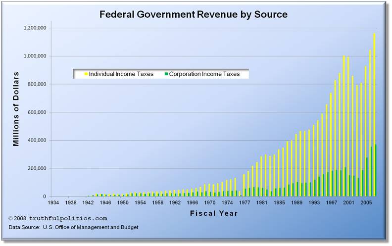
The second chart also shows how much tax revenue was received by the federal government annually since 1934 and its raw data comes from Table 2.1; however, the chart only shows individual and corporate income taxes.
Click on the chart below to see an enlarged, clearer chart.
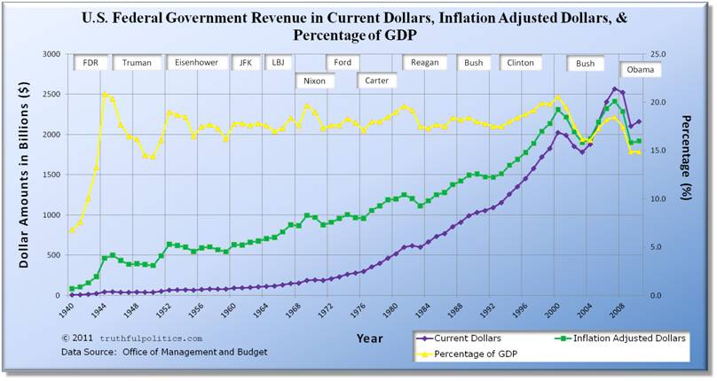
The third chart shows how much tax revenue was received by the federal government annually since 1940. The raw data comes from Table 1.3 of the budget report.
- Current Dollars displays the amount of revenue received in the value of the currency at the time received.
- Inflation Adjusted Dollars displays all dollar amounts in constant fiscal year 2005 dollars, as provided by the Office of Management and Budget. Therefore, dollar amounts prior to year 2005 are inflated and dollar amounts after 2005 are deflated. For example, U.S. federal government revenue in 1940 was $6.5 billion dollars; that revenue level is the equivalent of $81.4 billion in 2005 dollars. Likewise, U.S. federal government revenue in 2010 was $2,162.7 billion dollars; that revenue level is the equivalent of $1,919 billion in 2005 dollars.
- Percentage of GDP is the revenue received divided by the GDP for the year. GDP stands for Gross Domestic Product and is a measure of the economy as it measures the total market value of all final goods and services produced in a country in a given year. Therefore, tax revenue as a percentage of GDP shows U.S. federal government revenue as a percentage of the economy.
- The transition quarter, or TQ, in 1976 has been removed.
Click on the chart below to see an enlarged, clearer chart.
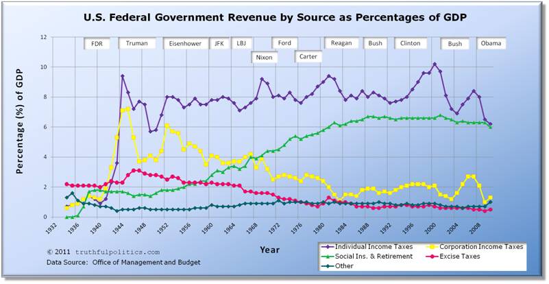
The fourth chart below shows how much tax revenue was received by the federal government annually since 1934 separated by different sources of revenue. The raw data comes from Table 2.3 of the budget report.
- The transition quarter, or TQ, in 1976 has been removed.
- Blank years of 1932 and 1933 have been added to make the year markers match presidential terms.
Click on the chart below to see an enlarged, clearer chart.
To read additional information, see the raw data, or view additional tables, click on Government Printing Office.
Sorry, the comment form is closed at this time.