Oct 082010
The Perot Charts website had a graph of the growth of the U.S. economy:
Click on the chart below to see an enlarged, clearer chart.

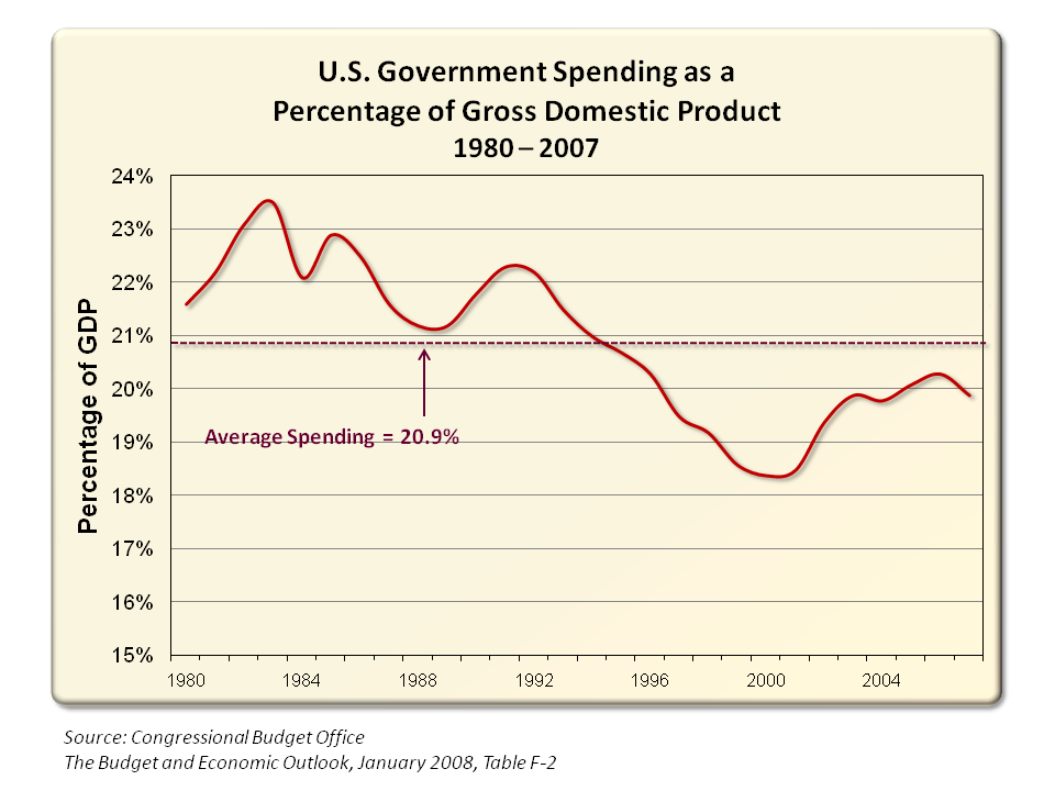
Therefore, when U.S. government spending is based as a percentage to the U.S. economy, the following trend develops:
Click on the chart below to see an enlarged, clearer chart.
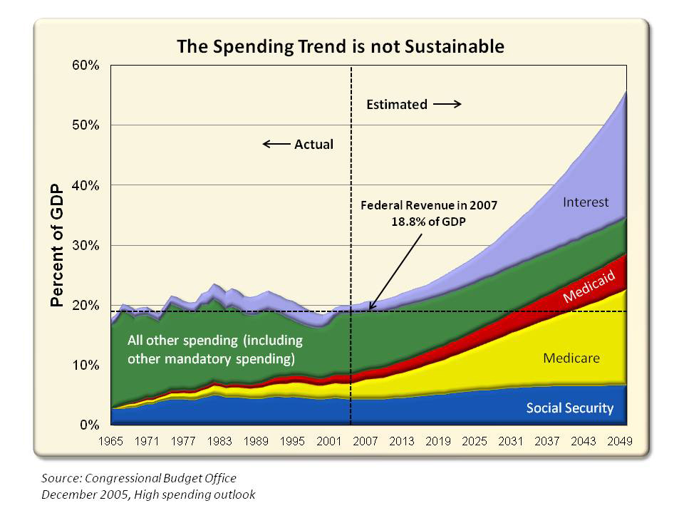
A projection of what the spending will look like in the future:
Click on the chart below to see an enlarged, clearer chart.
To view additional information and charts, click on U.S. Government Spending as a Percentage of Gross Domestic Product 1980 – 2007.
Patrick Henry had the following graph:
Click on the chart below to see an enlarged, clearer chart.
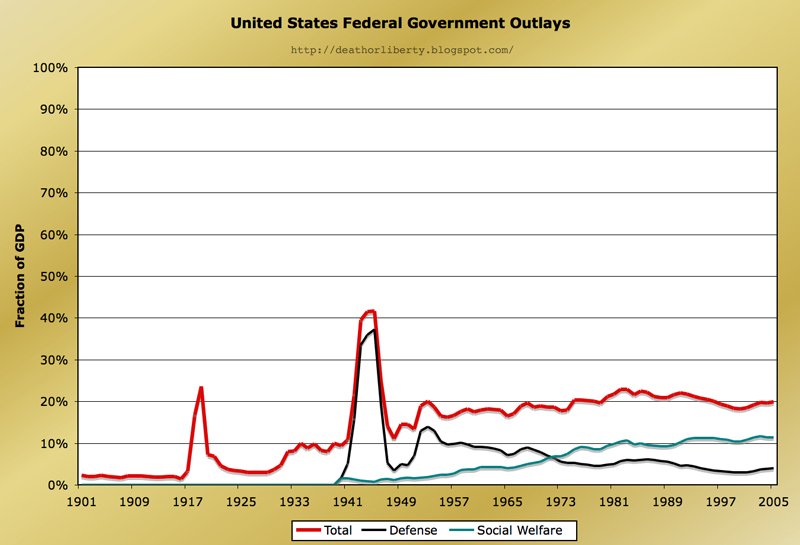
To read the entire article, click on government spending is NOT out of control.
Sorry, the comment form is closed at this time.