truthfulpolitics.com

The U.S. Consumes 75 Percent of the World’s Prescription Drugs

 Posted by  Health Care  Comments Off on The U.S. Consumes 75 Percent of the World’s Prescription Drugs
Apr 242017
 
Share

The National Institute on Drug Abuse “challenged the public to create Infographics that present current scientific information about prescription drug abuse in interesting, novel, and creative ways to help inform and educate the general public.” Below are six of the graphical presentations. All the sources for the data are at the bottom of the page.

Infographic 1:  52 Million people in the US, over the age of 12, have used prescription drugs non-medically in their lifetime.

52-million-people-used-prescription-drugs-non-medically

Infographic 2:  6.1 Million people have used prescription drugs non-medically in the past month; and the United States has 5 percent of the world’s population but consumes 75 percent of the the world’s prescription drugs.

In 2011, 52 million people in the US age 12+ had used prescription drugs nonmedically at least once in their lifetime, 6.2 million in the past month. The United States has 5% of the world’s population & consumes 75% of the world’s prescription drugs.

u-s-five-percent-of-population-consumes-seventy-five-percent-of-prescription-drugs

Infographic 3:  In 2010, enough prescription painkillers were prescribed to medicate every american adult every 4 hours for 1 month. The number of prescription medicine abusers in 2010 was 8.76 million. Most abused prescription drugs fall under 3 categories: painkillers at 5.1 million, tranquilizers at 2.2 million, and stimulants at 1.1 million.

In 2011, 2.4 percent of the U.S. population over the age of 12, or 6.1 million persons “used prescription-type psychotherapeutic drugs nonmedically in the past month.”  The estimate in 2010 was 2.7 percent, or 7 million persons.  “Among youths aged 12 to 17, the rate of current nonmedical use of prescription-type drugs declined from 4.0 percent in 2002 to 2.8 percent in 2011. The rate of nonmedical pain reliever use declined during this period from 3.2 to 2.3 percent among youths.”

most-abused-prescription-drug-categories-painkillers-tranquilizers-stimulants

Infographic 4:  Non-medical use of prescription drugs by state

non-medical-use-of-prescription-drugs-by-state

Infographic 5:  Where are prescription drugs obtained?

0.3%: Bought on the internet
1.9%: More than one doctor
2.2%: Other
3.9%: Drug dealer or stranger
16.6% Bought/took from friend or relative
18.1%: One doctor
54.2%: Free from friend or relative

where-are-prescription-drugs-obtained

Infographic 6:  Twelve reasons teens use prescription drugs:

62%: Easy to get from parent’s medicine cabinets
52%: Available everywhere
51%: They are not illegal drugs
50%: Easy to get through other people’s prescriptions
9%: Can claim to have prescription if caught (The infographic is incorrect)
43%: They are cheap
35%: Safer to use than illegal drugs
33%: Less shame attached to using
32%: Easy to purchase over the internet
32%: Fewer side effects than street drugs
25%: Can be used as study aids
21%: Parents don’t care as much if caught

12-reasons-teens-use-prescription-drugs

Sources:

“Combating Misuse and Abuse of Prescription Drugs: Q&A with Michael Klein, Ph.D.” Consumer Updates. United States Food and Drug Administration, 28 July 2010

“Prescription for Disaster. How Teens Abuse Medicine.” Drug Enforcement Administration, United States Department of Justice

Yachter, David (2009). Born a Champion: The Master Strategy for Maximum Health and Lasting Success. Outskirts Press

Kane, Jason. “Prescription Drug Abuse: Top 10 things CDC Says You Should Know.” PBS Newshour, 2013

“National Survey on Druge Use and Health.” Substance Abuse and Mental Health Services Administration, U.S. Department of Health and Human Services, 2011

“Topics in Brief: Prescription Drug Abuse.” National Institute on Drug Abuse

“State Estimates of Nonmedical Use of Prescription Pain Relievers.” Substance Abuse and Mental Health Services Administration, 8 Jan. 2013

Maxwell, Jane Carlisle. “Trends in the Abuse of Prescription Drugs.” The Gulf Coast Addiction Technology Transfer Center. The University of Texas at Austin, Nov. 2006


Mar 272016
 
Share

truthful politics reviewed unemployment, labor force participation, and job opening statistics provided by the United States Bureau of Labor Statistics. The Bureau of Labor Statistics provides the official numbers on the above for the U.S.  Several charts follow below. All of the charts expand to make the data easier to view. Click on a chart to expand it, and click on the expanded chart to shrink it back to its original size.

The table below lists the average unemployment rate during the tenure of the respective president since 1948.

  • The average unemployment rate during Democratic presidents is 5.71%, during Republican presidents 5.93%.
  • To view the raw data, use Series ID LNS14000000.
Unemployment Rate Average During Term President Political Party
4.26 Harry S. Truman Democratic
4.89 Dwight D. Eisenhower Republican
5.97 John F. Kennedy Democratic
4.17 Lyndon B. Johnson Democratic
5.09 Richard Nixon Republican
8.09 Gerald Ford Republican
6.54 Jimmy Carter Democratic
7.54 Ronald Reagan Republican
6.30 George H. W. Bush Republican
5.20 Bill Clinton Democratic
5.27 George W. Bush Republican
7.82 Barack H. Obama Democratic


The chart below shows the average unemployment rate each year.

  • Blank years of 1945, 1946, and 1947 have been added to make the year markers match presidential terms.
  • To view the raw data, use Series ID LNS14000000.

Click on the chart below to see an enlarged, clearer chart.
U.S. National Unemployment by Political Party or President

The chart below shows the average labor force participation rate each year.

  • To view the raw data, use Series ID LNS11300000.
  • Blank years of 1945, 1946, and 1947 have been added to make the year markers match presidential terms.

Click on the chart below to see an enlarged, clearer chart.
U.S. Labor Force Participation Rate by President or Political Party

The chart below shows the average amount of job openings each year.

  • To see the raw data on the Bureau’s website, use Series ID JTS00000000JOL.
  • For example, the average amount of job openings in 2001 was 4.28 million.

Click on the chart below to see an enlarged, clearer chart.
U.S. Average Annual Job Openings during Presidential Terms

To read additional information and/or review the source data, click on United States Bureau of Labor Statistics.


Daily Kos had a blog from September of 2008 by linuxguy. The following chart ranks presidents and political parties from reducing unemployment the most to reducing unemployment the least.

Unemployment Rate, U.S. Department of Labor: Bureau of Labor Statistics

period start end chng President   Party

Jan 1993 Jan 1997 7.3 5.3 -2.0   Clinton I   Democrat
Jan 1985 Jan 1989    7.3   5.4  -1.9   Reagan II Republican
Jan 1961 Jan 1965    6.6   4.9  -1.7   JFK/Johnson    Democrat
Jan 1965 Jan 1969    4.9   3.4  -1.5   Johnson  Democrat
Jan 1949 Jan 1953    4.3   2.9  -1.4   Truman   Democrat
Jan 1997 Jan 2001    5.3   4.2  -1.1   Clinton II Democrat
Jan 1981 Jan 1985    7.5   7.3  -0.2   Reagan I   Republican
Jan 1977 Jan 1981    7.5   7.5   0.0   Carter   Democrat
Jan 2005 Aug 2008    5.2   6.1  +0.9   Bush, GW II  Republican
Jan 2001 Jan 2005    4.2   5.2  +1.0   Bush, GW I Republican
Jan 1953 Jan 1957    2.9   4.2  +1.3   Eisenhower I Republican
Jan 1969 Jan 1973    3.4   4.9  +1.5   Nixon  Republican
Jan 1989 Jan 1993    5.4   7.3  +1.9   Bush, GHW  Republican
Jan 1957 Jan 1961    4.2   6.6  +2.4   Eisenhower II  Republican
Jan 1973 Jan 1977    4.9   7.5  +2.6   Nixon/Ford Republican

To read the entire article, click on Unemployment Rate by President and Party.


Mar 212016
 
Share

truthful politics reviewed U.S. debt statistics provided by the U.S. Office of Management and Budget. The Office of Management and Budget provides the official numbers on debt for the U.S. Below are several charts and pieces of information on U.S. federal debt.

  • From 1940 to the end of year 2015 (the latest figures available as of the writing of this article), the average increase in the federal debt was 9.3% under a Democratic President and 7.9% under a Republican President when including World War II.
  • When excluding World War II (therefore, 1946 to end of year 2015), the average increase in the federal debt was 4.7% under a Democratic President and 7.9% under a Republican President. The Republican President percentage remains the same when excluding World War II, because the United States had Democratic Presidents during World War II.
  • The first chart below shows the amount of U.S. federal debt in U.S. dollars.
  • Blank years of 1937, 1938, and 1939 have been added to make the year markers match presidential terms.
  • The transition quarter, or TQ, in 1976 has been removed.

Click on the chart below to see an enlarged, clearer chart.

United States Federal Debt by President and Political Party

The second chart below shows the amount of U.S. federal debt as a percentage of GDP.

  • GDP stands for Gross Domestic Product and measures the size of the economy.  Therefore, the chart shows the debt as a percentage of the U.S. economy.
  • I.e., in 1940, the federal debt equaled $50.696 billion and the economy was $98.2 billion.  Therefore, the federal debt as a percentage of GDP equaled 51.6%.
  • Blank years of 1937, 1938, and 1939 have been added to make the year markers match presidential terms.
  • The transition quarter, or TQ, in 1976 has been removed.

Click on the chart below to see an enlarged, clearer chart.

United States Federal Debt as a Percentage of GDP by President and Political Party

The table below shows the increase in U.S. federal debt during the tenure of the respective President:

Increase in Billions US $ President Political Party
$153 Franklin D. Roosevelt Democratic
$55 Harry S. Truman Democratic
$31 Dwight D. Eisenhower Republican
$20 John F. Kennedy Democratic
$58 Lyndon B. Johnson Democratic
$115 Richard Nixon Republican
$145 Gerald Ford Republican
$280 Jimmy Carter Democratic
$1,692 Ronald Reagan Republican
$1,401 George H.W. Bush Republican
$1,627 Bill Clinton Democratic
$4,357 George W. Bush Republican
$8,134 Barack H. Obama Democratic


The third chart below is an older chart that shows U.S. federal debt up to 2010.

Click on the chart below to see an enlarged, clearer chart.

United States Federal Debt by President and Political Party to 2010

To review the source data, click on Budget of the United States Government.


Steve McGourty created the following United States National Debt graph by president:

Click on the chart below to see an enlarged, clearer chart.

United States National Debt and the Presidents Responsible for It

To read the entire article, click on United States National Debt. To read additional truthful politics article on the federal debt, click on The Federal Debt or U.S. Federal Debt Change (Increase/Decrease) by President.


Mar 062016
 
Share

The Office of Management and Budget annually provides a report on spending. The two charts below display the most up to date data as of the time of publishing. To view the source data, please refer to Table 1.3 of the budget.

  • The first chart is inflation adjusted, displaying all dollar amounts in constant fiscal year 2009 dollars, as provided by the Office of Management and Budget.
  • Therefore, dollar amounts prior to year 2009 are inflated and dollar amounts after 2009 are deflated.  For example, U.S. federal government expenditures in 1940 were $9.5 billion dollars; that spending level is the equivalent of $135.8 billion in 2009 dollars. Likewise, U.S. federal government expenditures in 2015 were $3,688.3 billion dollars; that spending level is the equivalent of $3,336.0 billion in 2009 dollars.
  • Blank years of 1937, 1938, and 1939 have been added to make the year markers match presidential terms.
  • The transition quarter, or TQ, in 1976 has been removed.
  • Since 1940, the average percentage increase in government spending during Democratic presidents is 9.6% and the average percentage increase during Republican presidents is 2.2%. These aforementioned percentages include World War II.
  • When excluding World War II (therefore, since 1946), the average increase in government spending was 2.4% under a Democratic President and 2.2% under a Republican President. The Republican President percentage remains the same when excluding World War II because the United States had Democratic Presidents during World War II.

Click on the chart below to see an enlarged, clearer chart.

U.S. Federal Government Size, as Measured by Spending, by President and Political Party

The second chart below shows the amount of U.S. federal government spending as a percentage of GDP.

  • GDP stands for Gross Domestic Product and measures the size of the economy. Therefore, the chart shows spending as a percentage of the U.S. economy.
  • I.e., in 1940, federal spending equaled $9.5 billion and the economy was $98.2 billion. Therefore, federal spending as a percentage of GDP equaled 9.67% (the official historical tables say 9.6%).
  • I.e., in 2009, federal spending equaled $3,517.7 billion and the economy was $14,414.6 billion. Therefore, federal spending as a percentage of GDP equaled 24.4%.
  • Blank years of 1937, 1938, and 1939 have been added to make the year markers match presidential terms.
  • The transition quarter, or TQ, in 1976 has been removed.
  • When including World War II, the average spending as a percentage of GDP under a Democratic President was 20.7% and under a Republican President 19.6%.
  • When excluding World War II, the average spending as a percentage of GDP under a Democratic President was 19.0% and under a Republican President 19.6%. The Republican President percentage remains the same because the United States had Democratic Presidents during World War II.

Click on the chart below to see an enlarged, clearer chart.

U.S. Federal Government Size, as Measured by Spending, by President and Political Party

To read additional information, including the source data, click on Budget of the United States Government. For information on how the U.S. government spends money, click on How the Federal Government Spends Money.


Dec 022015
 
Share

truthful politics reviewed jobs statistics provided by the United States Bureau of Labor Statistics and the top tax rate provided by the Tax Policy Center and the Tax Foundation. The Bureau of Labor Statistics provides the official numbers on jobs gained or lost for the U.S.

  • The chart below shows how many jobs annually were created, or lost, nationally during presidential terms and/or political party.
  • The numbers are in thousands (i.e., in 1939, 1.6 million jobs were created). To see the raw data on the Bureau’s website, use Series ID CES0000000001.
  • Note: Jobs data for 2015 includes numbers through August only. Therefore, full year numbers will be different as September – December are added.
  • The chart also shows the top tax rate as a percent (i.e., in 2010, the top tax rate was 35%).
  • Blank 1937 and 1938 have been added to make the year markers match presidential terms.

Click on the chart below to see an enlarged, clearer chart.

U.S. Job Creation during Presidential Terms or Political Party and the Top Tax Rate

To read additional information, click on United States Bureau of Labor Statistics, Historical Individual Income Tax Parameters, or the Tax Foundation.


Annaly Salvos in Credit Writedowns in December 2010 reported the following:

  • In 1948, the top tax rate was slightly above 80% and the unemployment rate was approximately 4%.
  • In the early 1980’s, the top tax rate was 70% and the unemployment rate was approximately 7.5%.
  • In 2010, the top tax rate was 35% and the unemployment rate was approximately 9.5%.
  • During that same time period, the amount of jobs created (or lost) has stayed roughly the same, between 4 million jobs created during some years and 2 million jobs lost during other years.  The largest job losses happened in 2009 when the top tax rate was at 35%, near an all-time low.

To read the entire article and view additional charts, click on Jobs and Taxes.


Dr. Brijesh Mathur in April 2011 reported the following:

  • From 1981 to 2010, the percent growth rate of the U.S. economy has decreased.  The corporate tax rate was reduced in 1987 and has stayed approximately the same since.
  • Canada’s corporate tax rate decrease from 45% in 1997 to 30% in 2010.
  • During that same time period the percent of growth in business sector employment decreased from 2.5% to 1.5% before becoming negative in 2009.

Click on the chart below to see an enlarged, clearer chart.

Trends in Corporate Tax Rates for Canada and the U.S. from 1981 to 2010

Click on the chart below to see an enlarged, clearer chart.

Effect of Corporate Tax Cuts on GDP Growth Rates in Canada and the U.S. from 1981 to 2010

Click on the chart below to see an enlarged, clearer chart.

Relationship Between Corporate Tax Rates, GDP Growth, and Employment Growth in the Business Sector in Canada from 1997 to 2010

To read the entire article, click on Do Cuts in Corporate Income Tax Rates Increase GDP Growth and Business Sector Employment? : Three decades of Evidence from Canada & the US.


Craig Jennings in OMB Watch in August 2010 reported the following:

  • During the 1990’s, the top tax rate was 39.6% and small business employment rose 2.3%, or 756,000 jobs, annually.
  • Between 2001 and 2006, the top tax rate was 35% and small business employment rose 1%, or 367,000 jobs, annually.
  • He also displayed the following chart:

U.S. Top Marginal Tax Rate from 1913-2003

To read the entire article, click on Expiration of High-Income Tax Cuts Probably OK for the Economy.


U.S. Job Creation by President / Political Party

 Posted by  Economic Performance  Comments Off on U.S. Job Creation by President / Political Party
Nov 222015
 
Share

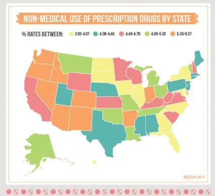
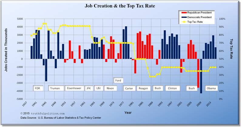
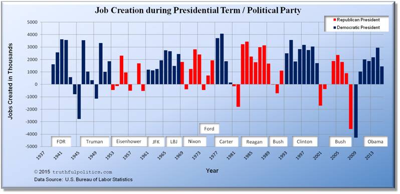
truthful politics reviewed jobs statistics provided by the United States Bureau of Labor Statistics. The Bureau of Labor Statistics provides the official numbers on jobs gained or lost for the U.S.

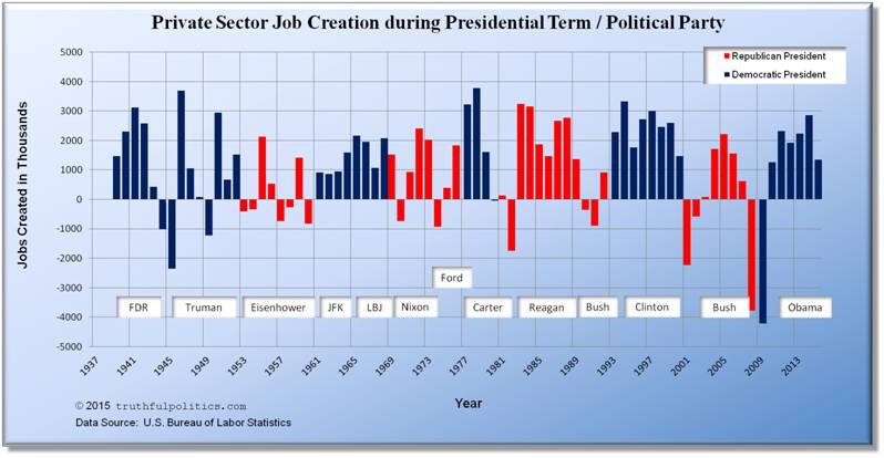
  • Both charts below show how many jobs annually were created, or lost, nationally during presidential terms and/or political party. The numbers are in thousands.
  • Blank 1937 and 1938 have been added to make the year markers match presidential terms.
  • Note: In both charts, data for 2015 includes numbers through August only. Therefore, full year numbers will be different as September – December are added.
  • The first chart displays all jobs, including government sector jobs (i.e., in 1939, approximately 1.6 million jobs were created). To see the raw data on the Bureau’s website, use Series ID CES0000000001.
  • The second chart displays all private sector jobs; government sector jobs are NOT included (i.e., in 1939, approximately 1.5 million jobs were created). To see the raw data on the Bureau’s website, use Series ID CES0500000001.
  • The average amount of all jobs created during Democratic Presidential terms is 1,748,610 and the average amount during Republican Presidential terms is 880,500.
  • The average amount of private sector jobs created during Democratic Presidential terms is 1,536,560 and the average amount during Republican Presidential terms is 650,330.
  • Therefore, the average amount of non-private sector jobs created during Democratic Presidential terms is 212,050 and the average amount during Republican Presidential terms is 230,170.

Click on the chart below to see an enlarged, clearer chart.

U.S. Job Creation during Presidential Terms or Political Party

Click on the chart below to see an enlarged, clearer chart.

U.S. Private Sector Job Creation during Presidential Terms or Political Party

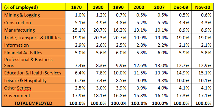
The table below lists the amount of private sector jobs created in thousands during each President’s tenure.  Again, this table displays all private sector jobs; government sector jobs are NOT included (i.e., during the years Harry S. Truman was President (1946 – 1952), approximately 8.78 million private sector jobs were created).  To see the raw data on the U.S. Bureau of Labor Statistics’ website, use Series ID CES0500000001.

Jobs Created in Thousands President Political Party
6,566 Franklin D. Roosevelt Democrat
8,781 Harry S. Truman Democrat
1,556 Dwight D. Eisenhower Republican
2,729 John F. Kennedy Democrat
8,895 Lyndon B. Johnson Democrat
5,254 Richard Nixon Republican
2,235 Gerald Ford Republican
8,601 Jimmy Carter Democrat
13,621 Ronald Reagan Republican
1,084 George H. W. Bush Republican
19,662 Bill Clinton Democrat
-338 George W. Bush Republican
7,765 Barack Obama Democrat


To read additional information, click on United States Bureau of Labor Statistics.


James Quinn in The Market Oracle in January 2011 displayed the following charts:

Click on the chart below to see an enlarged, clearer chart.

U.S. Jobs by Sector from 1970 to 2010

Click on the chart below to see an enlarged, clearer chart.

U.S. Jobs that are Goods Producing versus Services

Click on the chart below to see an enlarged, clearer chart.

U.S. Jobs that are Manufacturing versus Financial and Business Services

To read the entire article, click on U.S. Propaganda Ministers Pumping Out Jobs Recovery Propaganda.


David Fiderer in The Huffington Post in September 2008 compared job creation under Democratic and Republican presidential terms. “Since Truman was elected in 1948, 53.2 million new jobs were created during the 24 years when Democrats held The White House, and 38.3 million were created during the 36 years of Republican administrations.”

President Years in Office Millions of Jobs Added
Truman 1949 – 1952 5.2
Eisenhower
1953 – 1956
2.7
Kennedy/Johnson 1961 – 1964 5.7
Johnson 1965 – 1968 9.8
Nixon 1969 – 1972 6.1
Nixon/Ford 1972 – 1976 5.2
Carter
1977 – 1980
10.4
Reagan 1981 – 1984 5.2
Reagan 1985 – 1988 10.8
Bush 1989 – 1992 2.5
Clinton 1993 – 1996 11.6
Clinton 1997 – 2000 11.5
Bush 2001 – 2004 (0.1)
Bush 2005 – 2008 5.1


To read the entire article, click on The Simple Arithmetic of Employment: Job Growth Is Always Higher When a Democrat Is In The White House.


Wikipedia has a table with job gain/loss totals by president and political party.  In the “Party” column, “R” means Republican President and “D” means Democratic President.

U.S. President Party Term years Start jobs
(Jan)
Start jobs
(Sept)
End jobs
(Jan)
End jobs
(Sept)
Created
(Jan)
Created
(Sept)
Harding/Coolidge R 1921–1925 25,000 ** 29,500 ** +4,500 **
Calvin Coolidge R 1925–1929 29,500 ** 32,100 ** +2,600 **
Herbert Hoover R 1929–1933 32,100 ** 25,700 ** -6,400 **
Franklin Roosevelt D 1933–1937 25,700 ** 31,200 ** +5,500 **
Franklin Roosevelt D 1937–1941 31,200 ** 34,480 37,836 +3,280 **
Franklin Roosevelt D 1941–1945 34,480 37,836 41,903 38,500 +7,423 +664
Roosevelt/Truman D 1945–1949 41,903 38,500 44,675 43,784 +2,772 +5,284
Harry Truman D 1949–1953 44,675 43,784 50,145 50,365 +5,470 +6,581
Dwight Eisenhower R 1953–1957 50,145 50,365 52,888 52,932 +2,743 +2,567
Dwight Eisenhower R 1957–1961 52,888 52,932 53,683 54,387 +795 +1,455
Kennedy/Johnson D 1961–1965 53,683 54,387 59,583 61,490 +5,900 +7,103
Lyndon Johnson D 1965–1969 59,583 61,490 69,438 70,918 +9,855 +9,428
Richard Nixon R 1969–1973 69,438 70,918 76,290 77,281 +6,852 +6,363
Nixon/Ford R 1973–1977 76,290 77,281 80,237 83,532 +3,947 +6,251
Jimmy Carter D 1977–1981 80,692 83,532 91,031 91,471 +10,339 +7,939
Ronald Reagan R 1981–1985 91,031 91,471 96,353 98,023 +5,322 +6,552
Ronald Reagan R 1985–1989 96,353 98,023 107,133 108,326 +10,780 +10,303
George H. W. Bush R 1989–1993 107,133 108,326 109,805 111,358 +2,672 +3,032
Bill Clinton D 1993–1997 109,805 111,360 121,381 123,418 +11,576 +12,060
Bill Clinton D 1997–2001 121,381 123,418 132,696 131,524 +11,315 +8,106
George W. Bush R 2001–2005 132,696 131,524 132,752 134,240 +56 +2,716
George W. Bush R 2005–2009 132,752 134,240 133,977 129,734 +1,225 -4,506
Barack Obama D 2009–2013 133,977 129,734 135,293 131,694
(through 2011)
+1,316 +1,960
(through 2011)
Barack Obama D 2013–2015 135,293 142,246 +6,953


U.S. President Party Ave annual increase
(Jan)
Harding/Coolidge R +4.23%
Calvin Coolidge R +2.13%
Herbert Hoover R -5.41%
Franklin Roosevelt D +4.97%
Franklin Roosevelt D +2.53%
Franklin Roosevelt D +5.00%
Roosevelt/Truman D +1.61%
Harry Truman D +2.93%
Dwight Eisenhower R +1.34%
Dwight Eisenhower R +0.87%
Kennedy/Johnson D +2.64%
Lyndon Johnson D +3.90%
Richard Nixon R +2.38%
Nixon/Ford R +1.29%
Jimmy Carter D +3.06%
Ronald Reagan R +1.43%
Ronald Reagan R +2.69%
George H. W. Bush R +0.62%
Bill Clinton D +2.64%
Bill Clinton D +2.33%
George W. Bush R +0.01%
George W. Bush R +0.23%
Barack Obama D +0.25%
Barack Obama D +2.00%


To read the entire article, click on Jobs created during U.S. presidential terms. Lastly, Data Politica also has charts on job gains/losses. To view the chart, click on Monthly U.S. Jobs Created 1988-Present including Political Party and President.


U.S. Export-Import Bank Pros and Cons

 Posted by  Economic Performance, Government Spending  Comments Off on U.S. Export-Import Bank Pros and Cons
Oct 172014
 
Share

The Export-Import Bank of the United States is the official export credit agency of the United States.

A short history of presidential support for the Bank follows:

  • President Franklin D. Roosevelt (Democrat) established the Export-Import Bank of Washington through Executive Order 6581 on February 2, 1934.
  • President Dwight D. Eisenhower (Republican) on February 12, 1959 said, “[Ex-Im Bank’s] record of repaid loans and repayable loans, your infinitesimal portion of written-off loans is one that I can do nothing except to say congratulations to your Directors, the President, and to all of you.”
  • President John F. Kennedy (Democrat) on July 18, 1963 said, “…the Export-Import Bank has created a wholly new program of export financing which now provides U.S. business with credit facilities equal to any in the world.”
  • President Gerald Ford (Republican) on November 18, 1974 said, “In order for the United States to maintain its strong position in foreign markets, it is important that the Congress pass the Export-Import Bank bill and avoid attaching unnecessary encumbrances.”
  • President Ronald Reagan (Republican) on January 30, 1984 said, “Exports create and sustain jobs for millions of American workers and contribute to the growth and strength of the United States economy. The Export-Import Bank contributes in a significant way to our nation’s export sales.”
  • President Bill Clinton (Democrat) on May 6, 1993 said, “Export expansion obviously encourages our most advanced industries. I am committed to promoting these exports, and what’s where the Ex-Im Bank plays an important role.”
  • President George W. Bush (Republican) on June 14, 2002 said “I have today signed into law S. 1372, the Export-Import Bank Reauthorization Act of 2002. This legislation will ensure the continued effective operation of the Export-Import Bank, which helps advance U.S. trade policy, facilitate the sale of U.S. goods and services abroad, and create jobs here at home.””

In 2013, nearly 90 percent of Ex-Im Bank’s transactions — a record-high 3,413 — were for American small businesses.

To read more information, click on The Export-Import Bank of the United States.

Jim Puzzanghera in September 2014 in the Los Angeles Times reported the following:

  • About 60 other countries have similar agencies to the Export-Import Bank of the U.S. to assist the respective country’s companies sell their goods abroad.
  • The bank made a profit of $1.1 billion in 2013. The profit goes to the U.S. Treasury.
  • The U.S. Chamber of Commerce supported the extension of the bank’s charter.
  • The bank has had corruption allegations, i.e., SABA, Inc. defrauded the bank and paid a $3.5 million settlement.

To read the entire article, click on Export-Import Bank supporters relieved, worried by 9-month extension.

Doug Bandow in May 2014 in Forbes reported the following:

  • The bank returned $1.6 billion to the U.S. Treasury since 2008, however, the profit seems to be an “illusion.”
  • The bank’s real cost, considering opportunity cost, was $653 million in 1980.
  • The bank may shift employment from other sectors, instead of raising the overall employment level.
  • The bank supports 2% of the U.S.’s current exports.
  • “Two-thirds of the Bank’s loan guarantees last year backed Boeing sales to rivals of U.S. airlines. Delta blamed ExIm for having to halt its New York-Mumbai service after Air India expanded its flights using Bank-financed jets. Last year ExIm also subsidized an Australian iron mine in purchasing Caterpillar equipment, despite complaints from U.S. miners.”
  • “Boeing alone typically accounts for more than 40 percent of the Bank’s credit activities.”
  • Other corporations like General Electric, Lockheed Martin, Dow Chemical, Bechtel, John Deere, and Caterpillar also use the Bank.  “Veronique De Rugy of the Mercatus Center figured that the top ten recipients collect 75 percent of ExIm’s benefits.”

To read the entire article, click on Close the Export-Import Bank: Cut Federal Liabilities, Kill Corporate Welfare, Promote Free Trade.

Zachary Karabell In July 2014 in Slate reported the following:

  • Congress renewed the banks charter in 2012.
  • The “U.S. Export-Import Bank offered $27 billion in loan guarantees in 2013.”
  • Other countries, including China, Russia, and Brazil, provided a total of $175 billion that same year.
  • The Canadian government uses this model in its public-private partnerships.
  • The default rate is currently 0.237 percent, meaning 0.237% of the financing payments are overdue.

To read the entire article, click on Don’t Kill the Export-Import Bank.

Robert Samuelson in July 2014 in The Washington Post reported the following:

  • The Ex-Im Bank’s budget is $90 million dollars.  Therefore, out of the total federal budget of $3.5 trillion, the expense of the bank represents .00257% of the total U.S. budget.  (To see details of other U.S. government spending or compare the amount of money spent on the Ex-Im Bank versus other government agencies, click on Government Spending.)
  • The Bank has 400 employees.
  • “In 2013, the agency authorized $27.3 billion in direct loans, loan guarantees and credit insurance.”  Of that total, loan guarantees were $14.9 billion and direct loans were $6.9 billion.
  • “Since 2006, Ex-Im says its default rate has averaged less than 1 percent.”
  • Some examples of transactions in 2013 include: “a $155 million loan to Ghana for a hospital expansion supported by U.S. engineering and construction firms; a $1.1 billion loan guarantee to an Indonesian airline to buy Boeing jets; and a $694 million loan to an Australian company for U.S. mining and rail equipment from Caterpillar and General Electric.”
  • “In 2012, China’s credit subsidies alone exceeded Ex-Im’s by almost 50 percent.”

To read the entire article, click on The misleading debate on the Export-Import Bank.


Causes & Solutions of Income Inequality

 Posted by  Economic Performance, Taxes  Comments Off on Causes & Solutions of Income Inequality
May 252014
 
Share

Robert Gordon and Ian Dew-Becker in May 2008 wrote the following about economic inequality in the United States:

  • Between 1979 and 2005, the income gap for women between the 50th percentile and the bottom 10th percentile grew more than for men at the same income levels for the same time period.
  • Between 1973 and 2001, the decline in unions explains 14% of the increase in income inequality amongst male wages.
  • Between 1980 and 2000, the life expectancy of the bottom 10% of earners increased at only half the rate of the top 10%. “This may be the most important single source of the increase in inequality in the United States, and it combines not only unequal access to medical care services and insurance, but also to differences in personal habits and environment related to education and income.”
  • In 1993-1995, the top 5 corporate officers earned compensation equal to 5% of their firms total profits. In 2000-2002, the ratio increased to 12.8%.
  • “Why the disparity? America’s CEOs have had their pay inflated by generous stock options and having their pay set by peers on corporate boards, the survey finds, as well as institutional differences between the United States and other nations, including such things as regulations, unions, and social norms.”

To read the entire article, click on The Causes of Rising Income Inequality.

Why Has Inequality Grown, 2014

To read the entire article, click on Americans agree inequality has grown, but don’t agree on why.

Anne Bradley wrote the following:

  • One measure of income inequality is the Gini coefficient. The higher the Gini coefficient, the higher the income inequality. A Gini coefficient of 0 indicates perfect equality where everyone earns the same income, and a Gini coefficient of 1 indicates perfect inequality where one person holds all the income and everyone else has no income.
  • “The United States Gini coefficient in 1967 was .399 and in 2001 it was recorded at .466.”
  • The six causes of income inequality are family structure, technology, growing markets, immigration, property rights, and income mobility.
  • Changes in U.S. tax rules caused a shift from corporate to individual tax reporting. This shift accounts for more than half of the increase in the top 1%’s income share since 1986.
  • The increasing use by middle-income earners of tax-sheltered investments inside 401(k)s, IRAs, etc. makes it look like middle-income earners have less than in reality.
  • Transfer payments, such as Social Security, welfare, and farm subsidies do not show up in income, thus causing no change in income inequality. If the transfer payments were included, income inequality would be less.
  • “The Congressional Budget Office (CBO) reports that from 1979 to 2007 real (inflation-adjusted) average household income grew by 62 percent.”

To read the entire article, click on Why Does Income Inequality Exist?

“The Economist” in September 2013 wrote the following:

  • 95% of the growth in income from the economic recovery have gone to the richest 1% of people.
  • “The gap in test scores between rich and poor children is 30-40% wider than it was 25 years ago”.
  • Two causes for the gap between the rich and poor are fast technological change and rapid economic globalization, which have a likelihood to continue.
  • Three solutions for reducing income inequality are tax reform, deregulation, and early education.
  • Tax reform would include creating a simpler, flatter tax code with no exemptions to make the tax system more efficient while maintaining progressivity.
  • Early education would include universal pre-school. “According to the OECD, it ranks only 28th out of 38 leading economies in the proportion of four-year-olds in education.”

To read the entire article, click on Growing apart.

Julia Trello in Finances Online wrote the following:

  • In the past 30 years, income for the richest 1% in the U.S. increased by 275%.
  • In the past 30 years, income for the poor grew by 20%.

The solutions to income inequality are:

  • Improve the legal framework to prevent abuses.
  • Ensure that young people have access to food, education, and health care.
  • Improve the tax system.
  • Higher taxes for the upper-middle class and up.
  • Limit tax breaks, subsidies, and loopholes to major energy, agri-business, pharmaceutical, and financial companies.
  • Updating tax rates for corporations and individuals whose income is derived from investments.
  • Taking power to create credit away from banks.
  • Creating alternative methods of distributing purchasing power from wages, salaries, and dividends.

To read the entire article, click on Income Inequality: Views & Solutions From Experts.

In the documentary “Inequality for All,” the following solutions for income inequality were recommended:

  • “Raise the minimum wage and/or require employers to pay a living wage and enlarge the earned income tax credit.”
  • “Support efforts to unionize workers.”
  • Increase state support for public universities so tuition is reduced to the levels of the 1950s and 1960s (typically $0 – $500 per semester).
  • “Provide early childhood education and ensure that all K-12 schools offer world-class educations regardless of their students’ family incomes.”
  • “Cap executive pay and resurrect the Glass-Steagall Act.”
  • “Institute the so-called ‘Buffett Rule’ so that those who earn over $1 million annually (even from capital gains) pay at least the same tax rate as middle class families.”
  • “Enact campaign finance reforms that would place caps on campaign donation amounts and disallow corporations to take tax deductions for the cost of lobbyists.”

To view the documentary and read additional information, click on Inequality for All.


May 032014
 
Share

The Congressional Budget Office in April 2009 illustrated it’s “most recent estimates of federal effective tax rates (taxes as a percentage of income) across household income groups for the four largest sources of federal revenues.”

Effective Federal Tax Rates (2006)

Share of Total Before-Tax Income and Total Federal Tax Liabilities (2006)

Click on the chart below to see an enlarged, clearer chart.


Effective Federal Tax Rates by Income Quintile and Tax Source, 2006

Click on the chart below to see an enlarged, clearer chart.


Real After-Tax Average Income as a Percent of 1979 Income, By Income Group

Click on the chart below to see an enlarged, clearer chart.

>
Effective Federal Tax Rates by Household Type and Tax Source, 2006

Click on the chart below to see an enlarged, clearer chart.


Total Effective Tax Rate for Lowest Income Quintile by Household Type and All Households, 1979 to 2006

To see additional information, click on Data on the Distribution of Federal Taxes and Household Income.


Catherine Mulbrandon in April 2014 illustrated the data as following:

Click on the chart below to see an enlarged, clearer chart.


Cumulative Share Before and After Federal Taxes, 2007

Click on the chart below to see an enlarged, clearer chart.


Share of Total Income:  Before and After Federal Taxes, 1979-2009

Click on the chart below to see an enlarged, clearer chart.


Average income:  Before and After Federal Taxes, 2009

To view additional charts, click on How much do federal taxes redistribute income?