Gun Statistics

 Posted by  Miscellaneous Issues  Comments Off on Gun Statistics
Apr 242013
 
Share

This article contains information and statistics from various sources on guns, gun control, and gun violence.

James Agresti and Reid Smith in Just Facts reported the following:

Households With a Gun Adults Owning a Gun Adults Owning a Handgun
Percentage 40-45% 30-34% 17-19%
Number 47-53 million 70-80 million 40-45 million


Roughly 16,272 murders were committed in the United States during 2008. Of these, about 10,886 or 67% were committed with firearms.

During the years in which the D.C. handgun ban and trigger lock law was in effect, the Washington, D.C. murder rate averaged 73% higher than it was at the outset of the law, while the U.S. murder rate averaged 11% lower.

During 2002 and 2003, out of 17 million background checks resulting in 120,000 denials, the federal government prosecuted 154 people (about one-tenth of 1% of the denials).

In the three-year period from October 2003 through September 2006, the Bureau of Alcohol, Tobacco and Firearms (ATF) conducted 202 operations at 195 gun shows, leading to 121 arrests and 83 convictions (with some cases still pending as of June 2007).

A 1997 U.S. Justice Department survey of 14,285 state prison inmates found that among those inmates who carried a firearm during the offense for which they were sent to jail, 0.7% obtained the firearm at a gun show, 1% at a flea market, 3.8% from a pawn shop, 8.3% from a retail store, 39.2% through an illegal/street source, and 39.6% through family or friends.

Total Contributions Donations to Democrats Donations to Republicans Percent to Democrats Percent to Republicans
Gun Rights $22,467,579 $3,231,405 $19,195,400 14% 85%
Gun Control $1,888,886 $1,776,310 $112,326 94% 6%


To read the entire article and see additional charts and statistics, click on Gun Control Facts.

Full citation:  “Gun Control Facts.” By James D. Agresti and Reid K. Smith. Just Facts, September 13, 2010. Revised 2/11/13.


Don Kates and Gary Mauser wrote about the correlation between the amount of guns and the amount of deaths across different countries.

European Gun Ownership and Murder Rates
(rates given are per 100,000 people and in descending order)
Nation Murder Rate Rate of Gun Ownership
Russia 20.54 [2002] 4,000
Luxembourg 9.01 [2002] c. 0
Hungary 2.22 [2003] 2,000
Finland 1.98 [2004] 39,000
Sweden 1.87 [2001] 24,000
Poland 1.79 [2003] 1,500
France 1.65 [2003] 30,000
Denmark 1.21 [2003] 19,000
Greece 1.12 [2003] 11,000
Switzerland 0.99 [2003] 16,000
Germany 0.93 [2003] 30,000
Norway 0.81 [2001] 36,000
Austria 0.80 [2002] 17,000


Eastern Europe Gun Ownership and Murder Rates
(rates given are per 100,000 people and in descending order)
Nation Murder Rate Year Rate of Gun Ownership
Russia 20.54  [2002] 4,000
Moldova 8.13  [2000] 1,000
Slovakia 2.65  [2000] 3,000
Romania 2.5  [2000] 300
Macedonia 2.31  [2000] 16,000
Hungary 2.22  [2003] 2,000
Finland 1.98  [2004] 39,000
Poland 1.79  [2003] 1,500
Slovenia 1.81  [2000] 5,000
Cz. Republic 1.69  [2000] 5,000
Greece 1.12  [2003] 11,000


Intentional Deaths: United States vs. Continental Europe Rates
In order of highest combined rate; nations having higher rates than the United States are indicated by asterisk (suicide rate) or + sign (murder rate).
Nation Suicide Murder Combined rates
Russia 41.2* 30.6+ 71.8
Estonia 40.1* 22.2+ 62.3
Latvia 40.7* 18.2+ 58.9
Lithuania 45.6* 11.7+ 57.3
Belarus 27.9* 10.4+ 38.3
Hungary 32.9* 3.5 36.4
Ukraine 22.5* 11.3+ 33.8
Slovenia 28.4* 2.4 30.4
Finland 27.2* 2.9 30.1
Denmark 22.3* 4.9 27.2
Croatia 22.8* 3.3 26.1
Austria 22.2* 1.0 23.2
Bulgaria 17.3* 5.1 22.4
France 20.8* 1.1 21.9
Switzerland 21.4* 1.1 24.1
Belgium 18.7* 1.7 20.4
United States 11.6 7.8 19.4
Poland 14.2* 2.8 17.0
Germany 15.8* 1.1 16.9
Romania 12.3* 4.1 16.4
Sweden 15.3* 1.0 16.3
Norway 12.3* 0.8 13.1
Holland 9.8 1.2 11.0
Italy 8.2 1.7 9.9
Portugal 8.2 1.7 9.9
Spain 8.1 0.9 9.0
Greece 3.3 1.3 4.6


To read the entire report, click on Would Banning Firearms Reduce Murder and Suicide?


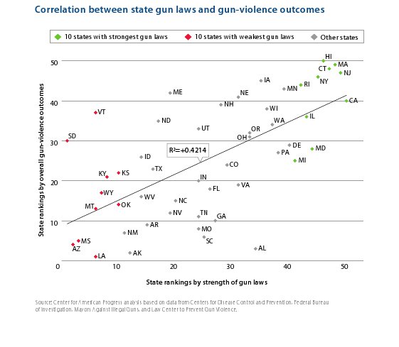
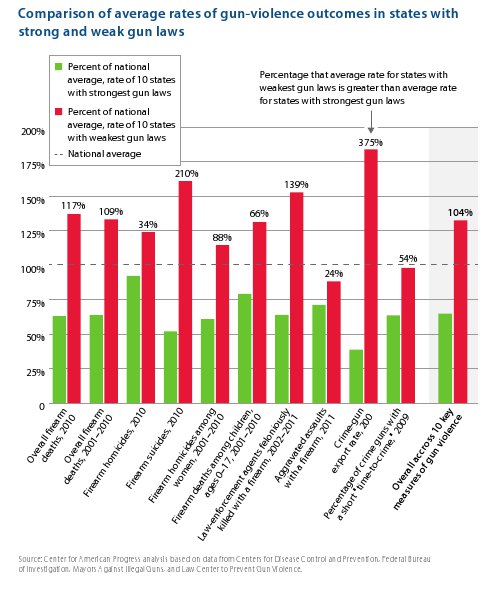
Arkadi Gerney, Chelsea Parsons, and Charles Posner in April 2013 from the Center for American Progress wrote about the 50 U.S. states and the correlation between gun violence and gun laws.

Click on the chart below to see an enlarged, clearer chart.

Correlation Between State Gun Laws and Gun-Violence Outcomes

Comparison of Average Rates of Gun-Violence Outcomes in States with Strong and Weak Gun Laws

To read the entire report, click on America Under the Gun.


Distribution of Income & Wealth

 Posted by  Economic Performance, Taxes  Comments Off on Distribution of Income & Wealth
Apr 212013
 
Share

This article contains information and statistics from several sources about income and/or wealth distribution in the United States.

G. William Domhoff in February of 2013 wrote about the distribution on income & wealth in the U.S.A.  The definition of wealth used in the article is the value of everything a person or family owns, minus any debts.

Income, net worth, and financial worth in the U.S. by percentile, in 2010 dollars

Wealth or income class Mean household income Mean household net worth Mean household financial (non-home) wealth
Top 1 percent $1,318,200 $16,439,400 $15,171,600
Top 20 percent $226,200 $2,061,600 $1,719,800
60th-80th percentile $72,000 $216,900 $100,700
40th-60th percentile $41,700 $61,000 $12,200
Bottom 40 percent $17,300 -$10,600 -$14,800


Net worth and financial wealth distribution in the U.S. in 2010

2011 U.S. Federal Government Spending by Agency


Income and wealth by race in the U.S.

2011 U.S. Federal Government Spending by Agency


CEOs’ pay as a multiple of the average worker’s pay, 1960-2007

2011 U.S. Federal Government Spending by Agency


CEOs’ average pay, production workers’ average pay, the S&P 500 Index, corporate profits, and the federal minimum wage, 1990-2005 (all figures adjusted for inflation)

2011 U.S. Federal Government Spending by Agency


Distribution of Income:
  • In 2008, 13,480 individuals or families made over $10 million.
  • 19% of the income reported by those individuals or families came from wages and salaries.

Distribution of income in the United States, 1982-2006

Income
Top 1 percent Next 19 percent Bottom 80 percent
1982 12.8% 39.1% 48.1%
1988 16.6% 38.9% 44.5%
1991 15.7% 40.7% 43.7%
1994 14.4% 40.8% 44.9%
1997 16.6% 39.6% 43.8%
2000 20.0% 38.7% 41.4%
2003 17.0% 40.8% 42.2%
2006 21.3% 40.1% 38.6%
2009 17.2% 41.9% 40.9%

Distribution of Wealth:
  • As of 2010, the top 1% of households owned 35.4% of all privately held wealth
  • The next 19% of households had 53.5%
  • Therefore, 20% of the people owned 89% (35.4% + 53.5%).
  • Thus, the bottom 80% of people owned 11% of the wealth.
  • 1.6% of Americans receive $100,000 or more in inheritance.
  • 1.1% receive $50,000 to $100,000.
  • The remaining 91.9% receive $0.

Share of wealth held by the Bottom 99% and Top 1% in the United States, 1922-2010.

Bottom 99 percent Top 1 percent
1922 63.3% 36.7%
1929 55.8% 44.2%
1933 66.7% 33.3%
1939 63.6% 36.4%
1945 70.2% 29.8%
1949 72.9% 27.1%
1953 68.8% 31.2%
1962 68.2% 31.8%
1965 65.6% 34.4%
1969 68.9% 31.1%
1972 70.9% 29.1%
1976 80.1% 19.9%
1979 79.5% 20.5%
1981 75.2% 24.8%
1983 69.1% 30.9%
1986 68.1% 31.9%
1989 64.3% 35.7%
1992 62.8% 37.2%
1995 61.5% 38.5%
1998 61.9% 38.1%
2001 66.6% 33.4%
2004 65.7% 34.3%
2007 65.4% 34.6%
2010 64.6% 35.4%


Percentage of wealth held in 2000 by the Top 10% of the adult population in various Western countries

wealth owned
by top 10%
Switzerland 71.3%
United States 69.8%
Denmark 65.0%
France 61.0%
Sweden 58.6%
UK 56.0%
Canada 53.0%
Norway 50.5%
Germany 44.4%
Finland 42.3%


Distribution of Taxes:

When all taxes (not just income taxes) are taken into account:

  • The lowest 20% of earners (who average about $12,400 per year) paid 16.0% of their income to various forms of taxes in 2009
  • The next 20% (about $25,000/year) paid 20.5% in taxes
  • The middle 20% (about $33,400/year) paid 25.3% in taxes
  • The next 20%, (about $66,000/year) paid 28.5% in taxes
  • The next 10%, (about $100,000/year) paid 30.2% in taxes
  • The next 5% ($141,000/year) paid 31.2% in taxes
  • The next 4% ($245,000/year) paid 31.6% in taxes
  • The top 1% (those who take in $1.3 million per year on average) paid 30.8% of their income to taxes.

Share of income paid as tax, including local and state tax

2011 U.S. Federal Government Spending by Agency


U.S.A. Income Inequality Compared to Other Countries:

“The degree of income inequality in the United States can be compared to that in other countries on the basis of the Gini coefficient, a mathematical ratio that allows economists to put all countries on a scale with values that range (hypothetically) from zero (everyone in the country has the same income) to 100 (one person in the country has all the income).”

Income equality in selected countries

Country/Overall Rank Gini Coefficient
1.  Sweden 23.0
2.  Norway 25.0
8.  Austria 26.0
10.  Germany 27.0
17.  Denmark 29.0
25.  Australia 30.5
34.  Italy 32.0
35.  Canada 32.1
37.  France 32.7
42.  Switzerland 33.7
43.  United Kingdom 34.0
45.  Egypt 34.4
56.  India 36.8
61.  Japan 38.1
68.  Israel 39.2
81.  China 41.5
82.  Russia 42.3
90.  Iran 44.5
93.  United States 45.0
107.  Mexico 48.2
125.  Brazil 56.7
133.  South Africa 65.0


To read the entire article, click on Wealth, Income, and Power.


David Cay Johnston in Reuters in October 2011 wrote the following:

  • About half of Americans paid no income taxes in 2009
  • The top 1 percent of Americans paid about 37 percent of the income taxes
  • Households “making less than $75,000 collectively paid more federal income tax than those making $1 million or more”
  • Income “taxed at the next-to-lowest rate, 15 percent, brought in more government revenue than all capital gains taxes plus the two top brackets, which apply only to the top 2 percent of earners”
  • Almost “half of the top 1 percent made less than $500,000” and five out of six of the top 1% made less than $1 million
  • “Someone at the entry point for the top 1 percent would need 29 years to make $10 million, and more than 2,900 years to make $1 billion”
  • The “top one-in-a-thousand taxpayers had average income in recent years that ranged between $5.2 million and $7.5 million annually.  Just investing that much in corporate bonds will produce enough interest income to keep someone in the top 1 percent.”
  • “The top 1 percent paid an average income tax rate of 24 percent in 2009, IRS data shows. That is almost exactly the rate paid by those making $500,000 to $1 million.  Those who made $1 million to $10 million paid a higher rate, 26 percent.  But those making more than $10 million paid a significantly lower rate, 23.3 percent.”
  • “The top 400 taxpayers paid a much lower rate. On an average income of $270 million each, their effective federal income tax rate was 18.1 percent in 2008, the latest year for which we have IRS data. A single worker earning less than $90,000 pays a higher rate than that.”

To read the entire article, click on Beyond the 1 percent.


According to the U.S. Census, 1.9% of all households earn more than $250,000 annually. To view the table, click on Income Distribution to $250,000 or More for Households: 2007.


Apr 082013
 
Share

Below is information from many different sources on how the U.S. federal government spends money. Several bar and pie charts are also included. All the charts expand to make the data easier to view. Click on a chart to expand it, and click on the expanded chart to shrink it back to its original size.

The first three charts are from the Office of Management and Budget, which provides the official numbers for the annual budget for the U.S.

  • The first chart shows spending by government agency as of 2011 (the most recent numbers available as of the writing of this article).
  • “Undistributed Offsetting Receipts” are not included.
  • Some of the percentages are 0% due to rounding.
  • To view the source data, please refer to Table 4.1 of the budget.

Click on the chart below to see an enlarged, clearer chart.

2011 U.S. Federal Government Spending by Agency

  • The second chart shows spending by government agency as of 2010.
  • Some of the percentages are 0% due to rounding.
  • To view the source data, please refer to Table 4.1 of the budget.

Click on the chart below to see an enlarged, clearer chart.

2010 U.S. Federal Government Spending by Agency

  • The third chart shows spending by government program as of 2010 (the most recent numbers available as of the writing of this article).
  • Some of the percentages are 0% due to rounding.
  • To view the source data, please refer to Table 27-14 of the budget.

Click on the chart below to see an enlarged, clearer chart.

2011 U.S. Federal Government Spending by Category or Program

To read additional information, including the source data, click on Budget of the United States Government.


The website Federal Budget Spending, Deficits, and the National Debt has the following graph:

Click on the chart below to see an enlarged, clearer chart.

How Congress Spends Your Money

Click on Federal Budget Spending, Deficits, and the National Debt to visit the website.


The Heritage Foundation has the following chart:

For more charts, click on Federal Budget in Pictures.


The Perot Charts website illustrates trends in federal government spending:

Click on the chart below to see an enlarged, clearer chart.

How the Federal Government Spends Money Pie Chart

Additional information and charts are no longer available as Perot Charts is now discontinued.


Project America illustrated overall U.S. federal government spending by department. The Department of Defense is not shown:

Click on the chart below to see an enlarged, clearer chart.

U.S. Federal Spending by Department

For additional information, click on Project America: Budget: Spending: Spending By Department.


Project America illustrated the overall U.S. federal government spending by program:

Click on the chart below to see an enlarged, clearer chart.

U.S. Federal Spending by Program Pie Chart

For additional information, click on Project America: Budget: Spending: Spending by Program.


MSN Money had an article summarizing how the US spends tax dollars:

  • The biggest single chunk of that so-called nondiscretionary spending — more than 20% of the total budget — is used to pay Social Security benefits to retirees
  • Another 15% pays the tab for Medicare health benefits
  • An additional 7% goes for Medicaid, 3% for veterans’ benefits and 1.3% for supplemental security income used to assist the aged, disabled and blind
  • Aid to poor families with children (welfare, which accounts for about 1% of the budget), food stamps (about 1.3%), farm subsidies (1%)
  • Interest on the debt claims about 10% of the budget

To read the entire article, click on How Uncle Sam spends your tax dollar.


Sep 132012
 
Share

truthful politics reviewed U.S. government employment statistics provided by the United States Bureau of Labor Statistics. The Bureau of Labor Statistics provides the official numbers on jobs for the U.S.

  • The chart shows the number of employees in thousands.
  • Federal employment is indicated on the left vertical axis (i.e., in January of 2012, federal employees, including the Postal Service, equaled 2.8 million).
  • State and local employment is indicated on the right vertical axis (i.e., in January of 2012, local employees equaled 14.1 million).
  • Blank years of 1937 and 1938 have been added to make the year markers match presidential terms.
  • To see the raw data on the Bureau’s website, use Series IDs CES9091100001, CES9091000001, CES9092000001, and CES9093000001.

Click on the chart below to see an enlarged, clearer chart.

U.S. Government Employment during Presidential Terms

To read additional information, click on United States Bureau of Labor Statistics.


PLA cited the following statistics:

  • “Under the 20 years of Republican administrations the number of non-defense government employees rose by 310,000.
  • Under the 20 years of Democratic administrations, the number of non-defense government employees rose by 59,000.
  • Of the 369,000 employees added between 1962 and 2001, 84% were added under Republican administrations and 16% were added under Democratic administrations.”

To read the entire article, click on Just for the Record Part II.


truthful politics reviewed the official Executive Branch and Uniformed Military employment numbers provided by the U.S. Government Printing Office.

Executive Branch Increase/Decrease Over Term (thousands) Uniformed Military Personnel Increase/Decrease Over Term (thousands) President Political Party
13 -108 John F. Kennedy Democratic
550 865 Lyndon B. Johnson Democratic
-193 -1301 Richard Nixon Republican
-15 -45 Gerald Ford Republican
-19 -22 Jimmy Carter Democratic
248 54 Ronald Reagan Republican
-47 -320 George H. W. Bush Republican
-308 -318 Bill Clinton Democratic
-4 -1 George W. Bush Republican

For further information, click on Budget of the United States Government: Main Page.


Brian Doherty in Reason in February 2003 reported that over the past 40 years, Democratic administrations have added 31,000 civilian defense jobs and 49,000 non-defense jobs. Republican administrations over the same time have reduced civilian defense jobs by 426,000 and added 320,000 non-defense jobs.

Government Employees Added or (Subtracted)

                  Civilian Defense  Non-Defense

Kennedy               (12,000)           73,000
Johnson                312,000          105,000
Nixon/Ford           (333,000)          213,000
Carter                (25,000)         (14,000)
Reagan                  91,000            3,000
George H.W. Bush     (184,000)          104,000
Clinton              (244,000)        (115,000)

Source: Budget for Fiscal Year 2003 Historical Table 17.1,
"Total Executive Branch Civilian Employees: 1940-2001"

To read the entire article, click on All the presidents’ employees – Data – federal employment growth or shrinkage by president – Brief Article.


Simpson-Bowles National Commission on Fiscal Responsibility and Reform

 Posted by  Economic Performance, Government Debt, Government Spending, Health Care, Taxes  Comments Off on Simpson-Bowles National Commission on Fiscal Responsibility and Reform
Sep 082012
 
Share

This article contains several charts and videos concerning the National Commission on Fiscal Responsibility and Reform. All the charts expand to make the data easier to view. Click on a chart to expand it, and click on the expanded chart to shrink it back to its original size.

The National Commission on Fiscal Responsibility and Reform was a bipartisan, meaning it involved members from both the Democratic and Republican political parties, commission “charged with identifying policies to improve the fiscal situation in the medium term and to achieve fiscal sustainability over the long run.” The Commission is sometimes referred to as the Bowles-Simpson Commission, Simpson-Bowles Commission, or Fiscal Commission.

The Commission had three groups:

  • Discretionary Working Group to “research and discuss issues related to discretionary spending.”
  • Mandatory Working Group to “research and discuss issues related to mandatory spending.”
  • Tax Reform Working Group to “research and discuss issues related to tax reform.”

Following are some of the charts and information from the report. Click on the chart to expand it for easier viewing, click again on the expanded chart to shrink it back to its original size.

Click on the chart below to see an enlarged, clearer chart.

Simpson-Bowles Debt as a Percent of GDP

Click on the chart below to see an enlarged, clearer chart.

Simpson-Bowles Annual Deficits Under Commission Proposal (as percent of GDP)

Click on the chart below to see an enlarged, clearer chart.

Simpson-Bowles Illustrative Individual Tax Reform Plan

Click on the chart below to see an enlarged, clearer chart.

Simpson-Bowles Illustrative Corporate Tax Reform Plan

Click on the chart below to see an enlarged, clearer chart.

Simpson-Bowles Fostering an Economic Recovery

Click on the chart below to see an enlarged, clearer chart.

Simpson-Bowles Commission Social Security Plan and Present Law as Percent of Taxable Payroll

To read the entire report, click on The Moment of Truth. To view the Commission website, click on National Commission on Fiscal Responsibility and Reform.


Following are three videos with the co-chairmen of the commission, Erskine Bowles and Alan Simpson.


U.S. Federal Government Revenue (Current & Inflation Adjusted)

 Posted by  Taxes  Comments Off on U.S. Federal Government Revenue (Current & Inflation Adjusted)
Sep 052012
 
Share

truthful politics reviewed historical statistics on U.S. federal government revenue as provided by the Office of Management and Budget. The Office of Management and Budget provides the official numbers for the annual budget for the U.S. This article has several charts on U.S. federal government revenue; click on the chart to expand it; click on the expanded chart to shrink it back to its original size.

The first chart shows how much tax revenue was received by the federal government annually since 1934. The raw data comes from Table 2.1 of the budget report.

  • The transition quarter, or TQ, in 1976 has been removed.

Click on the chart below to see an enlarged, clearer chart.

U.S. Federal Government Revenue by Source

The second chart also shows how much tax revenue was received by the federal government annually since 1934 and its raw data comes from Table 2.1; however, the chart only shows individual and corporate income taxes.

Click on the chart below to see an enlarged, clearer chart.

Federal Government Revenue by Source

The third chart shows how much tax revenue was received by the federal government annually since 1940. The raw data comes from Table 1.3 of the budget report.

  • Current Dollars displays the amount of revenue received in the value of the currency at the time received.
  • Inflation Adjusted Dollars displays all dollar amounts in constant fiscal year 2005 dollars, as provided by the Office of Management and Budget. Therefore, dollar amounts prior to year 2005 are inflated and dollar amounts after 2005 are deflated. For example, U.S. federal government revenue in 1940 was $6.5 billion dollars; that revenue level is the equivalent of $81.4 billion in 2005 dollars. Likewise, U.S. federal government revenue in 2010 was $2,162.7 billion dollars; that revenue level is the equivalent of $1,919 billion in 2005 dollars.
  • Percentage of GDP is the revenue received divided by the GDP for the year. GDP stands for Gross Domestic Product and is a measure of the economy as it measures the total market value of all final goods and services produced in a country in a given year. Therefore, tax revenue as a percentage of GDP shows U.S. federal government revenue as a percentage of the economy.
  • The transition quarter, or TQ, in 1976 has been removed.

Click on the chart below to see an enlarged, clearer chart.

U.S. Federal Government Revenue in Current Dollars, Inflation Adjusted Dollars, and Percentage of GDP

The fourth chart below shows how much tax revenue was received by the federal government annually since 1934 separated by different sources of revenue. The raw data comes from Table 2.3 of the budget report.

  • The transition quarter, or TQ, in 1976 has been removed.
  • Blank years of 1932 and 1933 have been added to make the year markers match presidential terms.

Click on the chart below to see an enlarged, clearer chart.

U.S. Federal Government Revenue by Source as Percentages of GDP

To read additional information, see the raw data, or view additional tables, click on Government Printing Office.

Governor Mitt Romney’s Record in Massachusetts

 Posted by  Miscellaneous Issues  Comments Off on Governor Mitt Romney’s Record in Massachusetts
Aug 152012
 
Share

This article contains statistics on state ranking, economic, education, poverty, debt, and health care areas of Mitt Romney’s record as governor of Massachusetts from 2003 – 2007.

Massachusetts’ ranking in CNBC’s America’s Top States for Business:

Category 2007 2012
Overall 12 28
Cost of Doing Business 40 49
Workforce 26 32
Quality of Life 3 11
Economy 41 21
Infrastructure & Transportation 38 45
Technology & Innovation 4 7
Education 1 3
Business Friendliness 13 29
Access to Capital 2 1
Cost of Living 43 41

To view rankings of all 50 states for both years above, click on America’s Top States for Business 2007 and/or America’s Top States for Business 2012.

Economic statistics:

  • During Romney’s tenure, Massachusetts lost manufacturing jobs faster than the national average
  • Massachusetts rate of losing manufacturing jobs was slower than before and after Mitt Romney took office
  • Massachusetts’ unemployment rate was 5.6% when Romney entered office and 4.7% when he left office
  • Romney vetoed a bill that would ban the state of Massachusetts from “contracting with companies that outsourced labor overseas”
  • In December 2006, Massachusetts’ unemployment rate was 4.7%, while the national average was 4.4%.

To read the entirety of the articles containing the source data, click on Claims and counter-claims on Mitt Romney’s Massachusetts record, Mitt Romney’s Massachusetts record: proof of ‘strong leadership’?, and/or the Bureau of Labor Statistics.

Education statistics:

  • During Romney’s tenure, the number of charter schools increased from 46 to 59
  • Massachusetts placed first on the National Assessment of Educational Progress exams from 2005-2011.
  • 2002-2003 high school (grades 9-12) dropout rate was 3.3%
  • 2006-2007 high school (grades 9-12) dropout rate was 3.8%
  • 2010-2011 high school (grades 9-12) dropout rate was 2.7%

To read the entirety of the articles containing the source data, click on Mitt Romney’s education record was mixed, Romney’s record on education includes successes, failures, and/or Dropout Rates.

Poverty statistics:

The table below shows the percentage of the population below the poverty level.

Year Massachusetts U.S.A.
2000 9.3% 12.4%
2007 9.9% 13.0%
2010 11.4% 15.3%

To view the source data or see data for other years and/or states, click on American FactFinder.

Debt statistics:

  • In 2007, Massachusetts had more debt per person, at $4,153, than any other state
  • Romney slowed the rate of debt growth from 5.8% to 1.9%
  • During Romney’s tenure, state debt averaged 9% of personal income, second worst in the nation.

To read the entirety of the article containing the source data, click on Is Romney’s Massachusetts record really as bad as Obama says?

Health Care statistics:

  • 62% of physicians say the law had no adverse effect on waiting times
  • In 2006, 68.5% of nonelderly adults supported the law, and in 2011, 67% supported it
  • In 2006, Massachusetts’ rate of uninsured was 7.7% (the lowest rate in the country) compared to the national average of 14.8%
  • In 2010, 98.1% of Massachusetts residents had health insurance compared to the national rate of 84.6%
  • The “net added cost to Massachusetts taxpayers was $353 million in 2010, or roughly 1.2 percent of the state budget”
  • About “$487 million of the 2010 Medicaid budget, about 5.2 percent, was for expansions under the health care law. (All those figures are before federal reimbursements.)”

To read the entirety of the article containing the source data, click on ‘RomneyCare’ Facts and Falsehoods.

U.S. Education Spending, Literacy, & Test Scores vs. Other Countries

 Posted by  Education  Comments Off on U.S. Education Spending, Literacy, & Test Scores vs. Other Countries
May 232012
 
Share

This article has several statistics from several sources on the U.S. education system compared to other countries.


The Broad Foundation reported the following:

  • U.S. ranks 21st in high school graduation rate compared to other industrialized nations.
  • U.S. students rank 25th in math compared to other industrialized nations.
  • U.S. students rank 21st in science compared to other industrialized nations.

To read additional information from the Broad Foundation on education, click on Background on the Crisis.


The Master of Arts in Teaching at the University of Southern California in February 2011 created the following chart which has spending, literacy, school life expectancy, and test score statistics:

Click on the chart below to see an enlarged, clearer chart.

U.S. Education Spending, Literacy, & Test Scores vs. Other Countries

To read the entire article, click on U.S. Education Spending and Performance vs. The World [INFOGRAPHIC].


The OECD created the following charts which compare education spending as a percentage of their respective economy (GDP) across several countries:

Click on the chart below to see an enlarged, clearer chart.

Expenditure on educational institutions as a percentage of GDP, for all levels of education

Click on the chart below to see an enlarged, clearer chart.

Expenditure on educational institutions as a percentage of GDP

Click on the chart below to see an enlarged, clearer chart.

Expenditure on primary and lower secondary educational institutions as a percentage of GDP and proportion of the population aged 5-14

To view the source data, click on Key indicators on education and use Indicator B2.  To view other charts and statistics, click on Key indicators on education.

Supreme Court Information

 Posted by  Miscellaneous Issues  Comments Off on Supreme Court Information
Apr 252012
 
Share

The Supreme Court of the United States was created in 1789. It’s Constitutional origin is in Article III. The court consists of a Chief Justice and eight Associate Justices. According to the Supreme Court official website, “The Supreme Court is the highest tribunal in the nation for all cases and controversies arising under the Constitution or the laws of the United States. The Court stands as the final arbiter of the law and guardian of constitutional liberties.”

To read more information about the Supreme Court, click on Supreme Court of the United States. To see a list of all Supreme Court Justice nominations, whether they were confirmed or not, the president who nominated them, etc., click on Supreme Court Nominations, Present-1789. To see Supreme Court statistics, click on SCOTUSblog Statistics.

Adam Liptak in The New York Times in November 2010 reported the following:

  • The Brown v. Board of Education decision in 1954 that said segregated public schools are unconstitutional was fewer than 4,000 words.
  • The Parents Involved v. Seattle in 2007 was 47,000 words.
  • Some decisions have been vague or ambiguous.
  • “In the 1950s, the median length of decisions was around 2,000 words.”
  • The Citizens United v. Federal Election commission decision in 2010 was more than 48,000 words.

To read the entire article, click on Justices Are Long on Words but Short on Guidance.

Carol J. Williams in the Los Angeles Times in April 2011 reported the following:

  • Korematsu v. United states in 1944 allowed the “internment of 110,000 Japanese Americans without individual cause or suspicion.”
  • Dredd Scott v. Sandford in 1857 decided that descendants of slaves were not entitled to Constitution liberties, including freedom and U.S. citizenship.
  • Buck v. Bell in 1927 said that institutionalized individuals may be sexually sterilized.

To read the entire article, click on Legal scholars examine the U.S. high court’s ‘Supreme Mistakes’.

The following video is from 60 Minutes in 2010:

To view the 60 Minutes website, click on 60 Minutes.