Jul 142011
 
Share

truthful politics has 3 different charts showing the number of jobs created in the U.S. organized by presidential terms and/or political party.

Apr 302011
 
Share

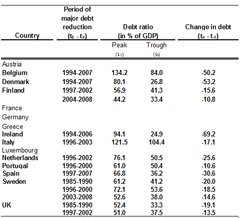
Below are statistics from several sources on if cutting taxes increase or decrease government revenue, or tax receipts. The first chart shows government revenue as a percentage of the economy, or Gross Domestic Product (GDP). The major tax cuts occurred in 1918 – 1925, 1964, 1981, 2001, and 2003.

Click on the chart below to see an enlarged, clearer chart.

U.S. Federal Government Revenue as a Percent of GDP from 1902 to 2015

For additional data, click on usgovernmentrevenue.com.


In the Bonddad Blog, information is available about cutting taxes for either the wealthy or the lower income classes.

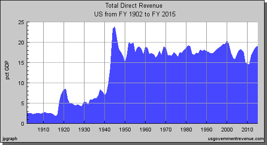
  • The following charts show government expenditures and government revenue during the 1980’s and the 2000’s.
  • Tax cuts were enacted in the early 1980’s and early 2000’s.
  • The blog concludes saying “the growth achieved is insufficient to stimulate the economy to high enough levels to make-up for the loss in revenue.”

Click on the chart below to see an enlarged, clearer chart.

1980 to 1988 federal government expenses and revenue

Click on the chart below to see an enlarged, clearer chart.

2001 to 2007 federal government expenses and revenue

To read the entire article, click on The Complete Failure of Supply-Side Economics.


Factcheck.org in June 2007 reported the following about tax cuts in 2001 and 2003 and the correlation with increased tax revenues:

  • “Federal revenue normally increases every year. In fact, revenues have declined in only five years since 1962.”
  • Tax revenues from 2000 to 2003 actually declined every year.
  • Tax revenues started to increase in 2004. The Office of Management and Budget described the increase in tax revenue in the years 2004-2006 as a return to the historical average. “As a percentage of GDP, federal receipts are now 18.4 percent of GDP (in line with the 40-year historical average of 18.3 percent).”
  • “The bulk of the growth in federal receipts has been in corporate tax revenue.”

To read the entire article, click on Supply-side Spin.


Daniel Mitchell in The New York Times in February 2002 said the following:

  • “In the 1960’s, President John F. Kennedy cut the top rate to 70 percent from 91 percent. Between 1961 and 1968, as the economy expanded by more than 42 percent and tax revenues rose by one-third, the rich saw their share of the tax burden climb to 15.1 percent from 11.6 percent.”
  • “In the 1980’s, the top marginal rate was cut to 28 percent from 70 percent. Critics charge that this caused higher federal budget deficits, but they misread the evidence. Although the Reagan tax cut was approved in 1981, it was phased in slowly (much as the Bush tax cut is scheduled to be). Once the cuts were in place, the economy grew and tax revenues soared. Revenues from personal income taxes increased 28 percent (adjusted for inflation) by 1989. And yes, the rich wound up paying more. The share paid by the top 10 percent jumped to 57.2 percent from 48 percent of total income tax revenues. The share for the top 1 percent rose to 27.5 percent in 1988 from 17.6 percent in 1981.”

The entire article may be read by clicking on Cutting Taxes Faster Would Help Everyone.


Stephen Moore in The Wall Street Journal in June 2005 said the following:

“Earlier this month the Congressional Budget Office released its latest report on tax revenue collections. The numbers are an eye-popping vindication of the Laffer Curve and the Bush tax cut’s real economic value. Federal tax revenues surged in the first eight months of this fiscal year by $187 billion. This represents a 15.4% rise in federal tax receipts over 2004. Individual and corporate income tax receipts have exploded like a cap let off a geyser, up 30% in the two years since the tax cut. Once again, tax rate cuts have created a virtuous chain reaction of higher economic growth, more jobs, higher corporate profits, and finally more tax receipts.”

The entire article can be read by clicking Real Tax Cuts Have Curves.


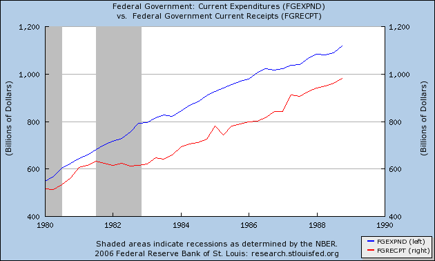
The Heritage Foundation has an article describing the Laffer Curve.

The following graph describes the Laffer Curve:

the Laffer Curve

The following graph illustrates the top income tax rate over time:

Click on the chart below to see an enlarged, clearer chart.

Top Marginal Personal Income Tax Rate from 1913 to 2003

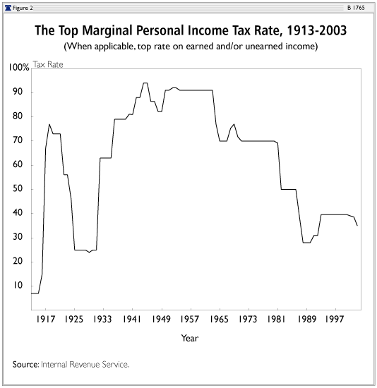
The Harding-Coolidge tax cuts decreased the top marginal tax rate from 77% in 1918 to 25% by 1925. The Heritage Foundation says that “over the four years following the tax-rate cuts, revenues remained volatile but averaged an inflation-adjusted gain of 0.1 percent per year. The economy responded strongly to the tax cuts, with output nearly doubling and unemployment falling sharply.”

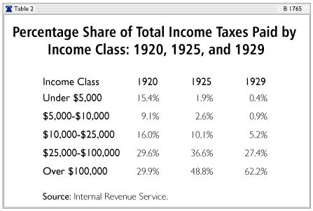
The following graph illustrates the percentage of total income taxes paid by different income brackets:

Percentage Share of Total Income Taxes Paid by Income Class from 1920 to 1929

The Kennedy tax cut in 1964 decreased the top marginal personal income tax rate from 91 percent to 70 percent. The Heritage Foundation says that “in the four years following the tax cut, federal government income tax revenue increased by 8.6 percent annually and total government income tax revenue increased by 9.0 percent annually. Government income tax revenue not only increased in the years following the tax cut, it increased at a much faster rate.”

The Economic Recovery Tax Act of 1981, signed into law under President Reagan reduced several different tax rates. The Heritage Foundation says that “between 1978 and 1982, the economy grew at a 0.9 percent annual rate in real terms, but from 1983 to 1986 this annual growth rate increased to 4.8 percent.” The Foundation continued, “the unemployment rate, which peaked at 9.7 percent in 1982, began a steady decline, reaching 7.0 percent by 1986 and 5.3 percent when Reagan left office in January 1989” and “between 1983 and 1986, federal income tax revenue increased by 2.7 percent annually, and total government income tax revenue increased by 3.5 percent annually.”

To read the entire article, click on The Laffer Curve: Past, Present, and Future.

Apr 172011
 
Share

Betty Ann Bowser of PBS NewsHour in April 2011 reported the following:

  • A study published in Health Affairs examined the records of 795 patients at three teaching hospitals.
  • 354 of the patients had experienced medical mistakes.
  • “90 percent of all hospital mistakes go unreported.”

To read the entire article, click on New Study Finds Medical Error Rates are Underreported. To read the entire study in Health Affairs, click on ‘Global Trigger Tool’ Shows That Adverse Events In Hospitals May Be Ten Times Greater Than Previously Measured.


Karen Davis of The Commonwealth Fund in November 2007 displayed the following data:

Medical Errors in Different Countries

She also mentioned “thirty percent of U.S. adults and 22 percent of Canadians said they could make same-day doctor’s appointments, compared with 55 percent in Germany.”

The entire article my be read by clicking on Health Care: Solutions Without Borders. For additional health care statistics between countries, click on Comparing International Health Care Systems.

Dec 182010
 
Share

Don Vergano in USAToday in December 2010 reported on U.S. education and how it compares to other countries:

  • 43% of U.S. high school graduates meet college readiness standards for mathematics.
  • 78% of U.S. parents believe their children to be in the top 20% in math performance. That figure is statistically impossible as only 20% of parents should report their children being in the top 20%.
  • 51% of parents in Singapore receive teacher advice on how to help their kids with math homework. In the U.S., the number is 25%.
  • 42% of parents in Singapore use math tutors for their middle school children. In the U.S., the number is 10%.
  • 92% of Singapore students “receive out-of-school math teaching”. In the U.S., the number is less than 50%.

The article references two reports, one called A Cross-Country Exploration of Math-Related Learning in the United States, England, and Singapore and the other called Rising Above the Gathering Storm, Revisited.

The latter report, created by The National Academies, also mentioned the following:

  • Federal government funding of research & development as a percentage of the economy (GDP) has declined 60% in the past 40 years.
  • Over 67% of all engineers who received PhD’s in U.S. universities were not U.S. citizens.
  • U.S. firms spend twice as much on litigation as they do on research.
  • U.S. K-12 education is behind other countries even though the U.S. spends more than any other OECD country.
  • “China is now second in the world in its publication of biomedical research articles, having recently surpassed Japan, the United Kingdom, Germany, Italy, France, Canada and Spain.”
  • “The United States now ranks 22nd among the world’s nations in the density of broadband Internet penetration and 72nd in the density of mobile telephony subscriptions.”
  • In 2009, 51% of U.S. patents were awarded to non-U.S. companies.
  • “Hon Hai Precision Industry Co. (computer manufacturing) employs more people than the worldwide employment of Apple, Dell, Microsoft, Intel and Sony combined.”
  • “Sixty-nine percent of United States public school students in fifth through eighth grade are taught mathematics by a teacher without a degree or certificate in mathematics.”


To read the entire USAToday article, click on Report: U.S. parents overconfident about kid’s math. To read the original A Cross-Country Exploration of Math-Related Learning in the United States, England, and Singapore report and press release, click on Raytheon-sponsored Study Examines Global Math Learning. To read the original Rising Above the Gathering Storm, Revisited report, click on Rising Above the Gathering Storm, Revisited.

Dec 052010
 
Share

truthful politics reviewed data from various sources on Social Security.  The official report that shows the current and projected financial status of Social Security is the Annual Report of the Board of Trustees of the Federal Old-Age and Survivors Insurance and Federal Disability Insurance Trust Funds.

Mark Weisbrot in the Center for Economic and Policy Research in December 2010 reported the following:

  • 60% of Americans under the age 0f 60 believe Social Security will not be there when they retire
  • 70% of Americans under the age of 50 believe Social Security will not pay them benefits when they retire
  • The official Social Security Trustees Report says that Social Security can pay all benefits for the next 27 years.
  • The official report also says that if no changes are made to Social Security in the next 27 years, then, starting in 2037, 75% of the scheduled benefits will be paid.  75% of scheduled benefits “would still be more than what retirees receive today, after adjusting for inflation.”
  • When discussions talk about public spending exploding in an unsustainable fashion, Social Security and Medicare are combined, however, it is Medicare whose spending explodes, not Social Security.
  • The increase spending for Medicare is caused by private sector health care costs rising.  “If these [private sector health care costs] were in line with any other high-income country such as Germany or Canada, our long-term budget deficit would turn into a surplus.”

According to the Social Security Trustees Report in 2010:

  • The Hospital Insurance (HI) Trust Fund, part of Medicare, is projected to last 12 years longer because of the health care reform laws passed in 2010.
  • The Medicare Supplementary Medical Insurance (SMI) program projected costs as a share of GDP over the next 75 years are down 23% from the projected costs in the 2009 report. This decrease is also due to the health care reform laws.

The following charts are from the Social Security Trustees Report. The charts have updated statistics based on the health care reform laws passed in 2010, respectively called the Patient Protection and Affordable Care Act of 2010 as amended by the Health Care and Education Reconciliation Act of 2010 (the “Affordable Care Act” or ACA).

OASI, DI, and HI Trust Fund Ratios

(Assets as a percentage of annual expenditures)
Click on the chart below to see an enlarged, clearer chart.

OASI, DI, and HI Trust Fund Ratios (Assets as a percentage of annual expenditures)

Social Security and Medicare Cost as a Percentage of GDP

Click on the chart below to see an enlarged, clearer chart.

Social Security and Medicare Cost as a Percentage of GDP

Income and Cost Rates

(Percentage of taxable payroll)
Click on the chart below to see an enlarged, clearer chart.

Income and Cost Rates

To read the entire CEPR article, click on Don’t Touch Social Security: Drive for Cuts Based on Deception.  To read the Social Security Trustees Reports from the most current year and previous years, click on Reports from the Board of Trustees. To read additional information on the charts, click on Status of the Social Security and Medicare Programs.

Nov 282010
 
Share

Daniel de Vise in The Washington Post in November 2010 reported on the graduation rates at for-profit colleges.

  • 55% of students enrolled in public universities graduate.  65% of students enrolled in private non-profit universities graduate.
  • The graduation rate at for-profit universities is 22%.
  • The University of Phoenix is the largest for-profit college with 238,326 students.  It’s graduation rate is 9%.
  • However, the School of Visual Arts in New York, another for-profit college, has a graduation rate of 67%.  (This percentage is part of the overall average of 22% listed previously.)
  • Bachelor’s “degree recipients graduate with a median debt of $31,190 in the for-profit sector, compared with $17,040 among private nonprofit colleges and $7,960 at public institutions. “
  • 12% of all college students attend for-profit colleges.  However, 43% of all student loan defaults are from for-profit college students.

To read the entire article, click on Report criticizes for-profit colleges for low graduation rates.

Frontline in May 2010 also reported on for-profit colleges. The report was titled College, Inc.

  • Graduates from a for-profit nursing school in California received diplomas but never went into a hospital during their schooling.
  • “One woman who enrolled in a for-profit doctorate program in Dallas later learned that the school never acquired the proper accreditation she would need to get the job she trained for. She is now sinking in over $200,000 in student debt.”
  • 10% of all college students attend for-profit colleges according to Frontline.  (The Washington Post report mentioned 12%.)  However, for-profit schools receive 25% of federal financial aid.
  • Also according to Frontline, 44% of students who defaulted were from for-profit schools.  (The Washington Post report mentioned 43%.)  This statistic leads “to serious questions about one of the key pillars of the profit degree college movement: that their degrees help students boost their earning power.”

To read and view the entire report/program, click on College, Inc. Also, to view the entire program online, click the video below.

Watch College Inc. on PBS. See more from FRONTLINE.

Nov 282010
 
Share

Michael Beckel of the Center for Responsive Politics in November 2010 reported on how one of the body scanning companies, L-3 Communications, used for airport security screenings made political gifts.

  • L-3 Communications contributed $466,300 to candidates and committees.
  • Some of the recipients of the political gifts are:
    • “Rep. Ike Skelton (D-Mo.), the chairman of the House Armed Services Committee, has collected $9,000 from the L-3 Communications PAC this cycle, and Rep. Norm Dicks (D-Wash.), the chairman of the House’s Defense Appropriations subcommittee, received $8,500 — including $2,000 in September.”
    • “Rep. Bennie Thompson (D-Miss.), is the chairman of the House Homeland Security Committee. Thompson has received $8,000 from the L-3 Communications PAC — including $1,500 in October.”

To read the entire article, click on Body Scanner Producing L-3 Communications Increases Political Gifts, Targets Power Brokers.

Kevin Bogardus in The Hill in November 2010 also reported on political contributions by the body scanner companies.

  • L-3 Communications is a defense contractor and received a contract for $165 million from the TSA.
  • “Linda Hall Daschle, a former administrator for the Federal Aviation Administration and wife of ex-Senate Majority Leader Tom Daschle (D-S.D.), is one of L-3’s best-connected lobbyists.”
  • Since 2004, L-3 Communications has spent $1.4 million on lobbying.
  • The other company with a TSA contract for body scanners is Rapiscan Systems.  “In 2009, the company was awarded an agreement that could be worth up to $173 million.”
  • Since 2007, Rapiscan Systems has spent approximately $3.6 million on lobbying.

To read the entire article, click on Airport body-scanner manufacturers armed for K Street battle.

Nov 232010
 
Share

Emily P. Walker in MedPage Today in November 2010 reported on high deductible health insurance plans (HDHP). According to IRS publication 969 (2009), at the time of this article, to qualify as a high deductible health insurance plan (HDHP), the minimum annual deductible for an individual is $1,200, and for a family is $2,400. Because of this higher deductible, the premiums are lower. Furthermore, lower-income families are defined as those living up to 300% of the federal poverty level. For example, for the 48 contiguous states including the District of Columbia, an individual at 300% of the federal poverty level earns $32,490 gross annually. A family of 4 at 300% of the federal poverty level earns $66,150 gross annually.

  • 50% of all families, regardless of income level, who were enrolled in high deductible health plans did not receive a recommended medical service in the past 6 months due to cost.
  • The percentage was 20% in a previous study that delayed or missed a medical service in the past year.
  • 51% of lower-income families delayed care in the past six months for an adult because of cost compared to 35% for higher-income families.
  • 24% of lower-income families delayed care in the past six months for a child because of cost compared to 14% of higher-income families.
  • 20% of lower-income families were more likely to delay or skip a medical operation or procedure because of cost compared to 6% of higher-income families.
  • A previous study found that raising co-payments from $10 to $20 for a cholesterol drug may cause 20% of patients to stop taking the drug.

2 possible solutions:

  • Reducing “deductibles for lower-income families, limiting deductibles to a proportion of a family’s income, or providing income-based cost-sharing subsidies”.
  • “Consumers cannot easily distinguish appropriate care from inappropriate care when deciding what to spend their money on, said Grann, who added that a “value-based insurance design” — in which co-payments are low for medical interventions determined to be of high value, and higher for those determined to be a low value — could be a better payment model than the current system, which places no judgments on the value of the services offered.”

To read the entire article, click on High-Deductible Health Insurance Results in Less Care. To read all of Publication 969, click on IRS Publication 969. To review the poverty guidelines, click on Extension of the 2009 Poverty Guidelines Until at Least May 31, 2010 or 2010 Federal Poverty Level.

Nov 222010
 
Share

Christiane Nickel, Philipp Rother, and Lilli Zimmermann of VoxEU.org, a portal set up by the Centre for Economic Policy Research, in November 2010 reported how some European countries were able to rapidly lower government debt. Some of these strategies could be implemented in the U.S. to lower its government debt.

  • As a government borrows more money, debt holders require higher interest rates.  This interest rate increase effects the sustainability additional government debt.
  • Secondly, high government debt may harm economic growth by crowding-out private investment.  The private sector may then reduce investment due to a lower rate of return.
  • Third, a country with a high debt level has less opportunity or flexibility to respond to economic shocks.
  • “For the successful consolidation experiences in the EU, the average total debt reduction per country amounted to almost 37 percentage points of GDP.”
  • There are three primary ways to reduce government debt: run a budget surplus by reducing spending, increase taxes, or grow the economy.
  • Inflation “is not a viable option for successful public debt reduction.”
  • The factors that affect major debt reduction:
    • “First, major debt reductions are mainly driven by decisive and lasting (rather than timid and short-lived) fiscal consolidation efforts focused on reducing government expenditure, in particular, cuts in social benefits and public wage spending. Revenue-based consolidations seem to have a tendency to be less successful.”
    • “Second, robust real GDP growth also increases the likelihood of a major debt reduction because it helps countries to ‘grow their way out’ of indebtedness. Here, the literature also points to a positive feedback effect with decisive expenditure-based fiscal consolidation because this type of consolidation appears to foster growth, in particular in times of severe fiscal imbalances.”
    • “Third, high debt servicing costs exert a disciplinary effect via market forces and require governments to set up credible plans to stop and reverse the increase in debt ratios.”
  • Spending cuts tend to work better than tax increases.
  • Governments should use economic upswings for spending cuts rather than tax breaks.

European Countries Major Government Debt Reduction

To read the entire article, click on Major public debt reductions: Lessons from the past, lessons for the future.