Nov 222010
 
Share

Justin Hyde in Jalopnik in November 2010 reported the following:

  • In 1966, Congress created the Department of Transportation and ordered it to create its own vehicles testing new safety features.
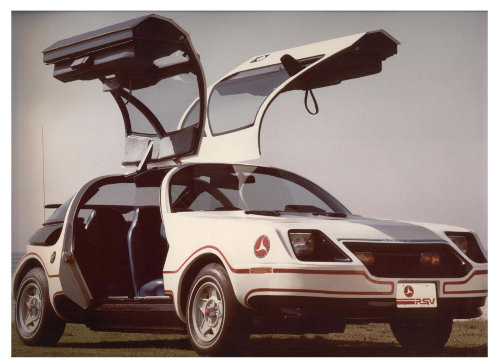
  • One experimental vehicle was the Minicar Research Safety Vehicle, created in 1977.
  • The Minicar RSV had bumpers that could withstand a 10 mph collision, run-flat tires, and airbags.
  • The Minicar RSV would get 32 miles per gallon.
  • The Minicar RSV could protect passengers after a 50 mph crash.  The National Highway Traffic Safety Administration (NHTSA) “claimed thousands of lives a year could be saved if Minicar tech became standard.”
  • In January 1981, President Ronald Reagan’s administration halted the Minicar RSV program.
  • The NHTSA “sent all remaining RSV cars to be destroyed.”
  • “Anti-lock brakes and air bags were standard on European cars first; Japanese automakers put the first crash-sensing brake system on the market in 2003, nearly 25 years after the RSV sported it.”
  • The crash test ratings now advertised, where cars receive 5 star crash test ratings, are based on a 35 mph crash speed.  That speed is 15 mph slower than the crash tests used for the RSV.

NHTSA Minicar RSV

To read the entire article, click on How The U.S. Government Killed The Safest Car Ever Built. For more information on the Minicar RSV from the NHTSA, click on THE MINICARS RSV – STILL A CAR FOR THE FUTURE.

Nov 212010
 
Share

Common Good reported the following statistics:

  • 88% of superintendents say that keeping up with all the government (local, state, and federal) mandates takes up too much time.
  • 54% of superintendents and 48% of principals say they “must work around the system” to “get things done the way they want.”
  • 81% of superintendents and 47% of principals and say that when talented superintendents or principals leave, the departure was most likely due to frustration with politics and bureaucracy
  • 24% of superintendents and 32% of principals say they have “enough autonomy to ‘reward outstanding teachers and staff.'”
  • 28% of superintendents and 32% of principals say they have sufficient authority to remove “ineffective teachers from the classroom.”
  • 56% of teachers agree “the tenure system should be changed to make it far easier to remove bad teachers.”
  • In the Grossmont Union School District, located in southern California, it took 13 years and $312,000 in legal costs to remove one teacher for incompetence.
  • In the entire state of Florida in 1997, 0.05% of teachers were removed involuntarily from their jobs.  In the entire state’s economy in the same year, 7.9% of all employees were fired.
  • In 2 Georgie counties, no tenured teacher was fired from 1995 to 2000.
  • New York City public schools employ 72,000 teachers.  The school board attempted to fire 3 teachers for incompetence over 2 years.

To read additional information, click on Law and Public Education: The Paralyzing Effects of Excessive Bureaucracy.

Nov 192010
 
Share

The following charts show U.S. state and local government spending. “Total Spending-l” is local spending and “Total Spending-s” is state spending.

Click on the chart below to see an enlarged, clearer chart.

U.S. State and Local Government Spending Chart

Click on the chart below to see an enlarged, clearer chart.

U.S. State and Local Government Spending as a Percent of GDP Chart

For additional data, click on usgovernmentspending.com.


Thomas A. Garrett and John C. Leatherman of Kansas State University in 2000 mentioned the following:

  • 1960: state governments spent $740 per person, local governments spent $670 per person
  • 1996: state governments spent $2,600 per person, local governments spent $1,600 per person
  • Between 1960 and 1996, state expenditures and revenues as a percent of GDP doubled
  • Between 1960 and 1996, local expenditures and revenues as a percent of GDP increased by 50%

To read the entire report, click on An Introduction to State and Local Public Finance.

Nov 162010
 
Share

The American Human Development Project, a nonpartisan initiative, completed their The Measure of America report.  It measures three categories:  health, education, and income.  Some of the findings are as follows:

  • U.S. life expectancy is 78.6 years, the same life expectancy for Chile.  Chile spends 10% of what the U.S. spends on health care.
  • The 11 “states with the shortest lifespans are in the South.”
  • Washington, D.C. scored the highest in Education with 85.8% of adult residents being high school graduates and 26.7% having graduate or advanced degrees.  Arkansas scored last with 82% of adult residents being high school graduates and 6.3% having graduate or advanced degrees.
  • “In every ethnic and racial group studied except Asian Americans, women have higher educational attainment and enrollment than men.”
  • “The wealth of the top 1 percent of households rose, on average, 103 percent (to $18.5 million per household) from 1983 to 2007.  The poorest 40 percent of households experienced a 63 percent decline in wealth during the same period (to $2,200 per household).”
  • Washington, D.C. has the highest median earnings of $40,342 and Arkansas has the lowest median earnings of $23,471.
  • “The wealthiest 20 percent of U.S. households have slightly more than half of the nation’s total income. The poorest 20 percent have 3.4 percent of total income.”
  • “In health, we must address the ‘Fatal Four’-the risk factors that are the most significant contributors to premature death, namely, smoking, poor diet, physical inactivity, and drinking to excess.”
  • “In education, research shows that quality preschool is the single most decisive means to prepare disadvantaged children for elementary school.”
  • In income, prevalent poverty affects health and education negatively.  Therefore, financial literacy should be included in the education system and retirement savings should have automatic enrollment to help build up assets.

The 3 risks to a long and healthy life:

  • The percentage of babies with a low birth weight
  • Diabetes rates
  • And, the trauma-related death rate.

The 3 risks to access to knowledge:

  • The percentage of 3- and 4-year-olds not enrolled in preschool
  • The percentage of fourth graders not demonstrating reading proficiency
  • And, the percentage of students not graduating from high school on time.

The 3 risks to a decent standard of living:

  • The number of children under the age of 6 living in households with incomes below the poverty line
  • The number of marginally attached workers
  • The number of renters with severe housing-cost burdens
  • And, the number of elderly living in poverty.

Click on the chart below to see an enlarged, clearer chart.

American Human Development Index by State

Click on the chart below to see an enlarged, clearer chart.

Life Expectancy at Birth by State

Click on the chart below to see an enlarged, clearer chart.

Educational Attainment and School Enrollment by Congressional District

Click on the chart below to see an enlarged, clearer chart.

Median Earnings for the Population by Congressional District

To read the entire report, click on American Human Development Project of the Social Science Research Council.

Nov 132010
 
Share

As of the writing of this article, the U.S ranks #40 out of 129 countries, according to the CIA, the Central Intelligence Agency, in highest ratio of debt to GDP.  The higher the ranking number the better; ergo, Libya has the lowest debt as a percentage of GDP and Zimbabwe has the highest. Other countries in the rankings:

  • Libya #129 (the lowest debt to economy ratio)
  • Equatorial Guinea #128
  • Iran #111
  • China #110
  • Mexico #68
  • Spain #42
  • India #34
  • France #17
  • Canada #13
  • Japan #2
  • Zimbabwe #1 (the highest debt to economy ratio)

To view the entire list and rankings on the CIA website, click on Country Comparison :: Public Debt.

Nov 122010
 
Share

Greg Ip in The Washington Post in November 2012 reported on misconceptions about current Federal Reserve Policies.

  • The Federal Reserve will create high inflation by creating the new Quantitative Easing policy and printing $600 billion.
    • The “money can lead to inflation only if banks lend it and consumers and businesses spend it.”  Currently, banks have not been lending and individuals and businesses have not been spending.
  • The Federal Reserve will devalue the dollar.
    • “If the Fed had an explicit policy of devaluing the dollar, it would sell dollars on the open market, buying foreign currencies in return. However, the Fed does this only with the Treasury’s consent, and it hasn’t done so since 2000.”
    • When the value of the dollar decreases, it helps increases U.S. exports.
  • The Federal Reserve is trying to help wasteful government spending.
    • “Hyperinflation in countries such as Zimbabwe or Weimar Germany occurred when private investors wouldn’t lend to the government, so the government printed money to finance its spending.”  Currently, there are plenty of private investors for U.S. treasuries.
  • The Federal Reserve is not susceptible to politics.
    • Presidents and Congress “can privately and publicly browbeat the chairman, withhold his reappointment, appoint compliant governors or amend the Federal Reserve Act.”
  • Ben Bernanke, the current Federal Reserve chairman, “knows what he’s doing.”
    • The “Federal Reserve’s history is littered with mistakes, from those that led to the Great Depression in the 1930s to those that brought on stagflation in the 1970s.”

To read the entire article, click on Five myths about the Federal Reserve.

Nov 092010
 
Share

The United States Department of Energy has mapped areas in the U.S. for renewable energy. The charts below show the availability for wind, solar, biomass, geothermal, and water (hydropower) energy sources in the U.S.

Wind:

Click on the chart below to see an enlarged, clearer chart.

United States Annual Average Wind Speed


Solar:

Click on the chart below to see an enlarged, clearer chart.

United States Average Daily Solar Radiation per Month


Biomass:

Click on the chart below to see an enlarged, clearer chart.

United States Biomass Resources Availability Map


Geothermal:

Click on the chart below to see an enlarged, clearer chart.

United States Geothermal Resource Availability


Water (Hydropower):

Click on the chart below to see an enlarged, clearer chart.

United States Water Energy Resource Assessment

Click on the chart below to see an enlarged, clearer chart.

United States Existing Hydroelectric Plants Map

Click on the chart below to see an enlarged, clearer chart.

United States Low Power Water Energy Sites

To read additional information or view additional maps, click on U.S. Department of Energy Renewable Resource Maps.

Nov 072010
 
Share

The Doing Business report, a project of The World Bank Group, annually publishes findings on the business climate of individual countries, business regulation and enforcement, and the impact on small to medium-size companies (ease of doing business).

  • The U.S. overall ranked 5th out of 183 countries, the same rank as 2010.  (The lower the number, the better.)
  • In individual topics, the U.S. ranked 9th in starting a business, 6th in getting credit, and 5th in protecting investors.
  • Furthermore, in individual topics, the U.S. ranked 27th in dealing with construction permits, 62nd in paying taxes, and 20th in trading across borders.

Click on the chart below to see an enlarged, clearer chart.

In the Past 5 Years 85% of Economies Made it Easier to do Business

To read the entire report for 2011, click on Doing Business.

Nov 062010
 
Share

truthful politics analysed a portion of the voting record for Congressman John Boehner, Republican from Ohio. Some of the larger, or well-known, bills are listed including the cost or savings to the federal government. CBO stands for Congressional Budget Office and is a nonpartisan agency of the United States federal government.

  • 2010 – voted for Prohibiting 2010-2011 Congressional Cost-of-Living Pay Increase (H.R. 5146)
  • 2010 – voted against Health Care and Education Affordability Reconciliation Act of 2010 (H.R. 4872, commonly referred to as the “Health Care Reform Reconciliation Bill”)
    • saves $143 billion per the CBO
  • 2009 – voted against Patient Protection and Affordable Care Act (H.R. 3590, commonly referred to as the “Health Care Reform Bill”)
  • 2009 – voted against Appropriations, Tax Law Amendments, and Unemployment Benefit Amendments (H.R. 1, commonly referred to as the “Stimulus Bill”)
    • spends $787 billion per the CBO
  • 2008 – voted for Financial Asset Purchase Authority and Tax Law Amendments (H.R. 1424, commonly referred to as the “Bailout Bill”)
    • spends $700 billion per the CBO
  • 2008 – voted for Economic Stimulus Plan (H.R. 5140)
    • spends $124 billion per the CBO
  • 2007 – voted against Pay-As-You-Go Rule (H.Res. 6)
  • 2002 – voted for Medicare Modernization and Prescription Drug Act (H.R. 4954)
    • spends $337 billion per the CBO
  • 2001 – voted for No Child Left Behind Act (H.R. 1)
    • spends $135 billion per the CBO
  • 2001 – voted for Economic Growth and Tax Relief Reconciliation Act (H.R. 1836)
    • increases the debt by $1.35 trillion per the CBO
  • 1995 – voted for Balanced Budget Proposed Constitutional Amendment (H.J. Res 1)
  • 1993 – voted for Penny Amendment to the Government Reform and Savings Act of 1993 (H.Amdt. 416)
    • saves $90 billion per Project Vote Smart
  • 1993 – voted against Economic Stimulus Package (H.R. 1335)
    • spends $26 billion per Project Vote Smart

According to The Washington Post, Congressman Boehner votes with his party 95.7% of the time.  According to Open Congress, he votes with his party 97% of the time.

To access the voting record, click on Project Vote Smart, or OpenCongress, or The Washington Post.  To access CBO estimates, click on Congressional Budget Office.

Nov 022010
 
Share

If an individual spent $1 million dollars a day for the past 2000 years, ignoring leap year days, they would have spent $730,000,000,000, or $730 billion dollars ($1,000,000 * 365 * 2000).

The US Department of the Treasury lists the total Federal debt at over $13,668,825,497,341, or $13.6 trillion. This number will inherently be incorrect in a short amount of time. Regardless, the debt number means that since the founding of these United States over 200 years ago, the federal government has spent $13.6 trillion more than what it has.

Therefore, the U.S. has spent more money than it earned in the past 200 years than someone who would have spent $1 million dollars a day for the past 2000 years.

To find out the current debt to the penny, go to The Debt to the Penny and Who Holds It. To read additional truthful politics article on the federal debt, click on U.S. Federal Debt by President/Political Party or U.S. Federal Debt Change (Increase/Decrease) by President.